Visual Communication
The Commercial Creative: Why This Trend Matters in 2020
By Daniel Long - 5 min read

As one of the creative creative trends to watch in 2020, the Commercial Creative combines Pop Art with post-modern design elements.
As part of our series of articles celebrating the release of our free Visual Trends Report 2020, we look at why the Commercial Creative is the big trend to watch in the new year.
For similar content and more visual ideas to inspire your next campaign, you may find the following articles relevant to your brand:

The Shock Of The New: Why It’s Still Relevant
Less than two decades after Andy Warhol first presented his repetitious series of Campbell’s soup cans to the world in 1961, art critic Robert Hughes later coined a new phrase that would come to define the scene’s influence on the art world. He called it the “The shock of the new”. And when we analyse the postmodern art scene from a brand perspective, there are two takeaways that we can all use to attract more customers:
1. A strong campaign must confront audiences
There are many different ways for marketers to help their campaign stand out. One tool is to draw your customer in with a concept that makes it harder to look away. Take for example, Andy Warhol’s controversial Car Crash Fourteen Times. The raw intensity of that work twists our traditional interpretation of trauma by reproducing it in a way that is both uncomfortable and challenging.
By the same logic, brands also need their own creative shockwave to get noticed in an ultra-crowded market online. There is so much “sameness” in the creative industry, that generic subjects and rote visuals will simply not work with media-savvy consumers that demand creative experimentation and innovation.

If you want your customers to engage more in your next campaign, say something different by pushing the visual limits. A campaign that engages their audience by being instantly recognisable is already starting from a stronger position. It also helps to personalizes the content too, which is always desirable when your brand is global or regional.
Importantly, don’t do what everybody is doing - change things up by doing the opposite of what your customer would expect. Because of social media, campaigns can easily lose visibility as they compete for eyeballs with millions of other similar ideas and products. A solid marketing strategy builds upon good ideas before it, but also brings something new to the table.

2. An effective campaign must be memorable
One of the reasons we still reference Pop Art today is because Warhol’s artworks were so visually iconic. As a cultural movement that symbolised the freedom and energy of the free-wheeling 60s, Pop Art is still influencing brands today with its style and symbolism. Likewise, modern campaigns should attempt to reference their own art influences and contemporary events without appearing tired, stale or generic.
It’s also important to remember that a memorable campaign is more than just a selection of strong visuals. A great campaign stands out visually because it dares to go places other campaigns won’t. When your competitors are doing all the same things visually, then it’s time to go in new creative directions. A memorable campaign doesn’t wait to be influenced by other product advertising - it influences the competition to go in their own direction by being the first.

Why The Creative Commercial is 2020’s Trend to Watch
In our Visual Trends Report 2020, we gave name to the creative campaign style that mixes bright and poppy art styles with a blend of post-modernist design elements. You may have seen it online or printed across billboards already.
The style is here and it’s only going to get bigger. The Commercial Creative’s blend of multiple art styles can be both expressive and abstract. But it’s never safe or conservative. We believe it will continue to be one of the year’s most influential campaign styles.

How to Influence an Entire Industry Vertical With One Style
The following campaign visuals were recently produced by Klarna and N26 (a campaign we helped to produce and shoot). Both companies are fintech startups challenging the traditional players in the finance industry and each of these companies are playing with traditional references of pop art, art deco and 1980s Milan-inspired Memphis Design.
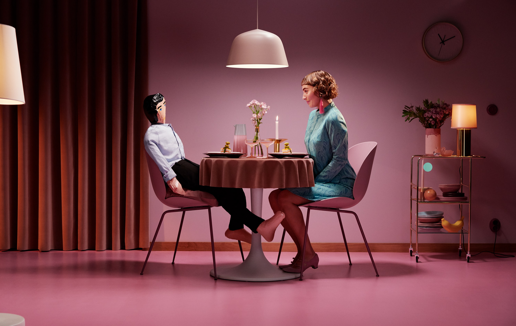
Klarna campaign image (above)
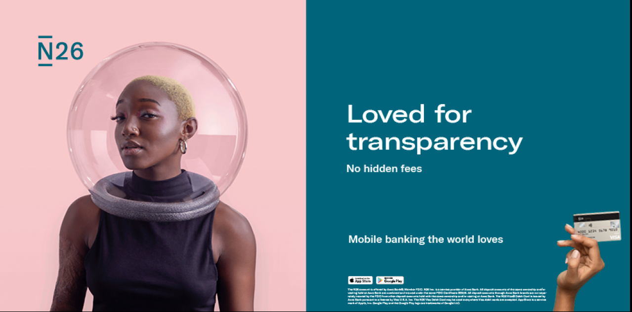
In each of the images, you can see the same visual style playing out. Is it by coincidence that two of the world’s largest and most innovative fintech brands use similar color palettes, abstract shapes and non-traditional subjects? Probably not.
The Commercial Creative is a big part of the creative signature of each of these campaigns. It’s visual motifs are instantly identifiable by their audience. Above all, these campaigns are visually memorable and offer a unique twist on traditional finance industry advertising - an industry that has been slow to innovate visually until recently. That’s why we expect more companies to go forward with their variation of the Commercial Creative in 2020.