Visual Communication
The Color Trends to Watch in 2020
By Daniel Long - 5 min read
We take a closer look at why color palettes are trending back to nature and how brands can leverage these choices to engage more customers.
The right colors can make or break your design. And just as importantly, the way we use color is a very important signal to our customers in how they perceive brand recognition. In addition to being the first visual elements that your potential customers will absorb when they see your product or logo, color can be used as a persuasive and powerful sales tool, conjuring up emotional qualities that help us to feel a certain way when we experience the product.
The psychological impact of color helps brands to reference the larger themes that influence customer behaviour, triggering emotions that help more customers to make positive decisions about your brand.
Let us inspire you
For similar content and more visual ideas to inspire your next campaign, the following articles might be relevant to your brand:
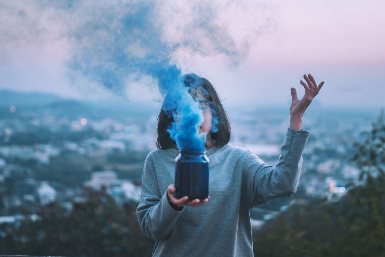
Generation Blue is EyeEm’s Color of 2020
What is Generation Blue? We approached 2020’s color trend of the year in our Visual Trends 2020 Report with two central themes in mind; one that reflects aspirational millennial desires and another that celebrates minimalism. In our report (which you can download now for free), we qualified some of the most important creative and visual trends for 2020, while providing a deeper analysis on the impact of millennial lifestyles in the new decade.
In our research, we found that blue campaign visuals helped to project optimistic millennial values at a time when millennial consumers have become the largest (and some might consider the most influential) demographic in the US.
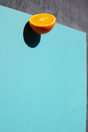
Of all the possible colors to choose from, blue’s restorative ability helps us to relax and stay calm, making it one of the safest brand colours to use. As inviting as an ocean beach or as cold as frozen ice, blue is able to project both sadness and happiness in equal measures. It can be bright and energetic and also quiet and contemplative. This artistic dichotomy speaks volumes to blue’s diverse emotional palette.
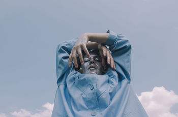
Is Blue the Answer to Generational Discontent?
Blue defines the times we live in and from a creative perspective, helps us to adapt to the prevailing undercurrent of generational uncertainty. As we approach another decade of climate angst, global political instability and soaring inequality, we were inspired to reference a color range that is this generation’s modern visual noise anathema. It’s a color that helps to relax us and provide comfort during uncertain times. From a campaign perspective, these shades of Blue helps us to achieve a sense of balance and focus.
We purposely chose a color that could provide photographers with comfort and serenity in their campaign visuals, offering a creative palette that could be considered either traditional or post-modern. Generation blue is flexible, tolerant and reliable as a campaign color choice for all kinds of moods and emotions.
It’s a Good Year to be Blue
We’re not the only company to proclaim 2020 as the year of blue. Three weeks after we published our Visual Trends Report 2020, we noticed that industry paint leaders Pantone had pronounced 2020 as the year of Classic Blue. On their website, Pantone cited elegance and simplicity as major reasons for their choice.
Not surprisingly, they also cited the restorative and peaceful properties of the color as one of the main reasons for their selection. Versed in catchy buzzwords, Pantone painted their choice with heavy brushstrokes (if you excuse the pun), and talked of fostering resilience and tranquility at a time when we could do with a little more tranquility in our lives.
Pantone wasn’t the only paint company to go Blue in 2020. US-based Sherwin Williams chose Naval Blue 6244 as their color pick of the year. The main reason for its selection? An opportunity to get back to nature. This leads us to our next big color trend to watch in 2020: natural colors.
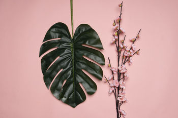
How The Environment Influences Color Trends
If 2020 is the year of Generation Blue and Classic Blue, it’s also the year of conservation and eco-awareness. With the planet still burning and climate change continuing to dominate the global news headlines, another paint titan has thrown its weight behind the environment with Behr deciding on Back to Nature (S340-4) as its color of 2020. Behr’s palette choice is a rural inspired yellowy mix of paddock-green and according to their own press, a chance to ‘embrace the spirit of discovery’ by indulging in restorative and revitalizing properties - a description that could also fit the same reasons for going with calm and peaceful blue.
Environmentally-themed colors have always been popular in color marketing. In the last five years, the big paint companies have loudly called attention to the world’s climate issues with their eco-color coordination, now re-imagined as a color-themed cartel intent on drawing attention to nature. Gloabl paint companies have been less than subtle in their hints that all of us should be talking more about conservation in our campaigns - declaring loudly and prominently that these are THE issues their customers are worried most about.
So perhaps it wasn’t just a mere coincidence, but early in 2019, Pantone chose to make their grand environmental statement by affirming 2019 as the year of Living Coral. By raising global awareness to the state of our oceans and coral reefs, Pantone made a bet on more of us turning towards colors that symbolized the eco-battles playing out on the world’s political stage. But not everybody agreed with Pantone’s reinterpretation of pink. Only a few years before, Pink had gone through another reinvention. Does anyone remember Millennial Pink? It’s emergence as a symbol of a social-media generation played out across consumer brands, influencing everything from ‘rose gold’ iPhones to Wes Anderson’s kitchy pink hues on the set of his film, ‘The Grand Budapest Hotel’.
Brands were dishing out pink-themed campaigns with vigor. But Living Coral wasn’t just trying to address millennial malaise, it was a new political weapon aimed at denouncing the lack of action on climate change. Some critics called it greenwashing, and denounced the color palette as marketing hubris. Either way, brands can no longer afford to stand still while the biggest and most influential events in generations play out on a world stage. Campaigns that choose their colors carefully and mindfully will be in the strongest position to attract and convert more customers.
Welcoming back Miami Pastel Retro
Have you ever heard of Miami Pastel?
While the emphasis on global climate action welcomes a natural color palette, retro color schemes are also increasingly finding favour with creatives.
Art deco is back in a big way. The fluro-bright retro images adorn the walls of some of Miami’s most famous art-deco period buildings. These colors form part of our Commercial Creative trend from our Visual Trends Report 2020.