Community
All Things Visual: Balancing Consistency with Creativity in Marketing
By Lars - 5 min read
Some killer examples of beautiful and impactful marketing.
What’s the key to effective visual branding? We asked our friends at Promo by Slidely, whose mission is to visually connect people and businesses. In this guest post, they share some tips – and explain why unusual approaches often work best.
Everything online, from searches to how we consume media, is visually based. Gone are the days when copy was king. Currently, content with relevant images gets 94% more views, and tweets with images receive 150% more retweets than those without images.
Making an impact in marketing means leaving your visual mark. And, since we process visual information 60,000-times faster than text, the visuals you create have to do some heavy lifting. So how can small business marketers and creatives create visual interest in order to compete? Let’s break down some killer examples of beautiful and impactful marketing.
Color & Content: Sharing a clear visual message through consistent branded content
Like any branded message, your visuals need to be strategic. While the images you pick shouldn’t feel so similar that they’re repetitive, offering viewers a signature style through color palette or overall subject matter shows a brand’s point of view and creates a consistent branded feel.
These guidelines especially apply to videos, as they make an even bigger impact. In fact, 4x as many consumers would prefer to watch a video about a product than to read about it, and by the end of 2017, video content will represent 74% of all internet traffic, 85% by 2018. This makes premium content – especially video – a vital communication tool for marketing materials.
GoPro
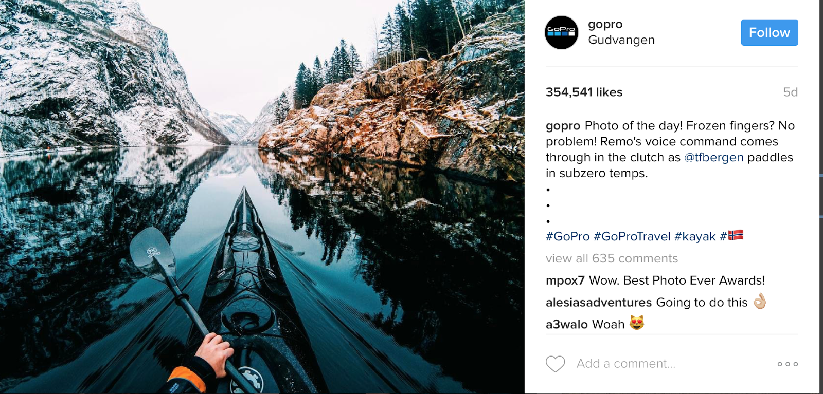
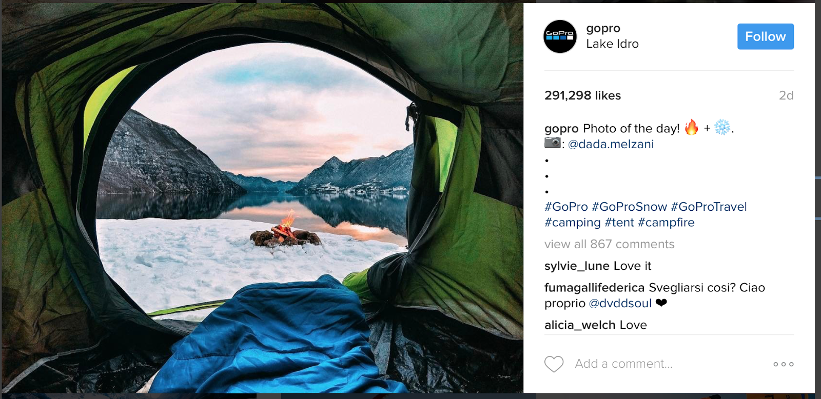
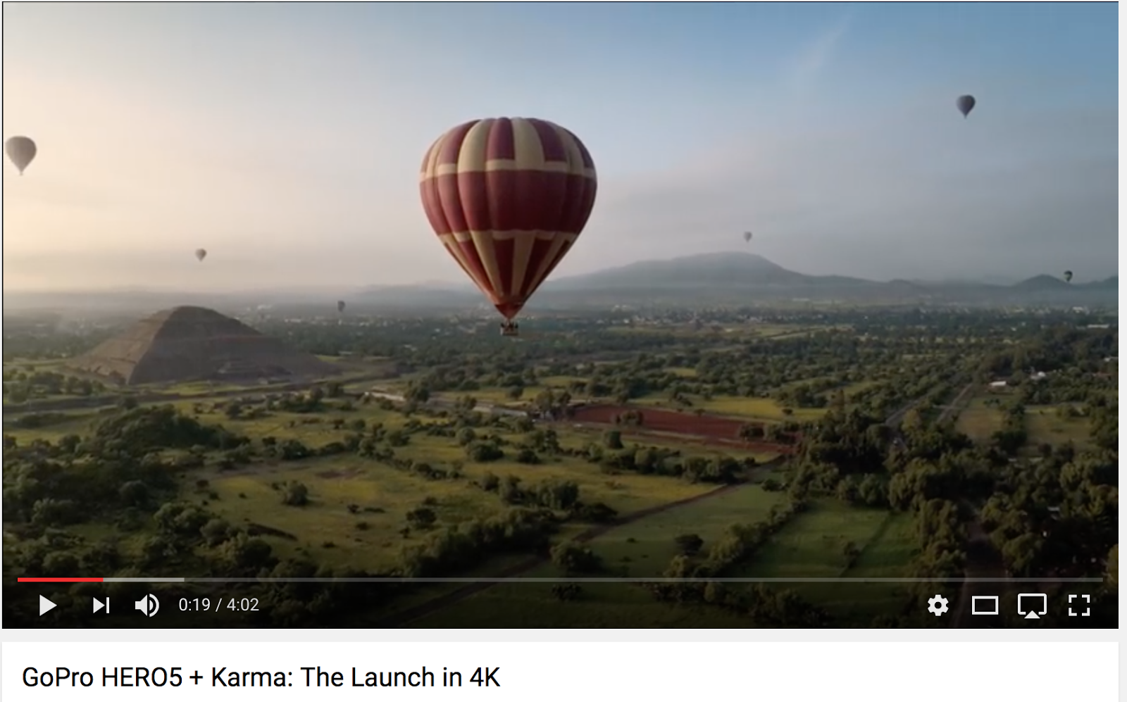
GoPro’s entire marketing strategy is built around visuals. They use stills and footage captured by their users to show breathtaking images. These images let the GoPro audience feel like they’re also doing something spectacular. For filmmakers, it’s a chance to share and show off their incredible adventures and talent for capturing high quality content.
All the while, GoPro sells the merits of their product. They constantly use vivid, over-saturated colors and adventure imagery. GoPro focuses on open landscapes and adventure travel which helps viewers buy into a lifestyle that’s easily recognizable and all the while the user generated content works hard to sell cameras.
WeWork
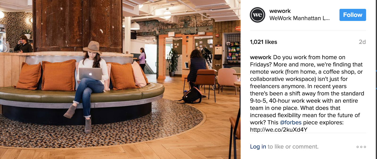
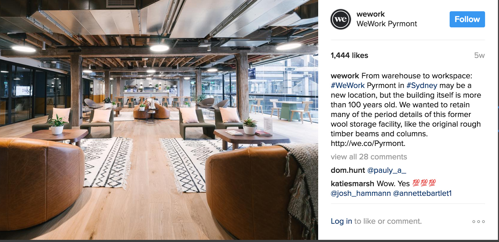
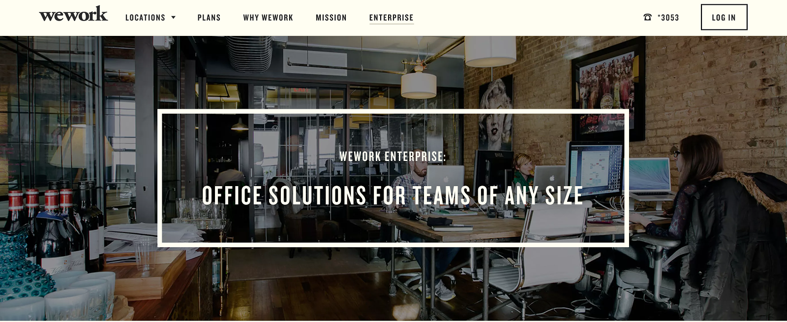
Shared workspace company WeWork curates marketing campaigns that show the benefits of a co-working community. Much like GoPro, WeWork is promoting a lifestyle. But in this case, it’s a lifestyle based on an relaxed office environment. Their images and videos reflect idealized and comfortable surroundings, all within a warm, earthy color scheme. This combination of color and content makes viewers feel invited and at home in their offices.
Foundos Realty
You don’t need a big budget to make a lasting impression. Foundos Realty, a small real estate company, uses humorous imagery to sell its services. It’s an unusual way for a real estate firm to sell itself online. Their current campaign focuses on visuals from outer space and makes a quick and memorable impact perfect for a visual marketing campaign.


Foundos from Slidely on Vimeo.
Tone & Type: Using stylized imagery and typography to evoke your brand’s essence
The tone an image conveys is often as important as what the image communicates. Stylizing images with consistent typography and a particular mood makes for highly recognizable brands that make a lasting impression.
Warby Parker
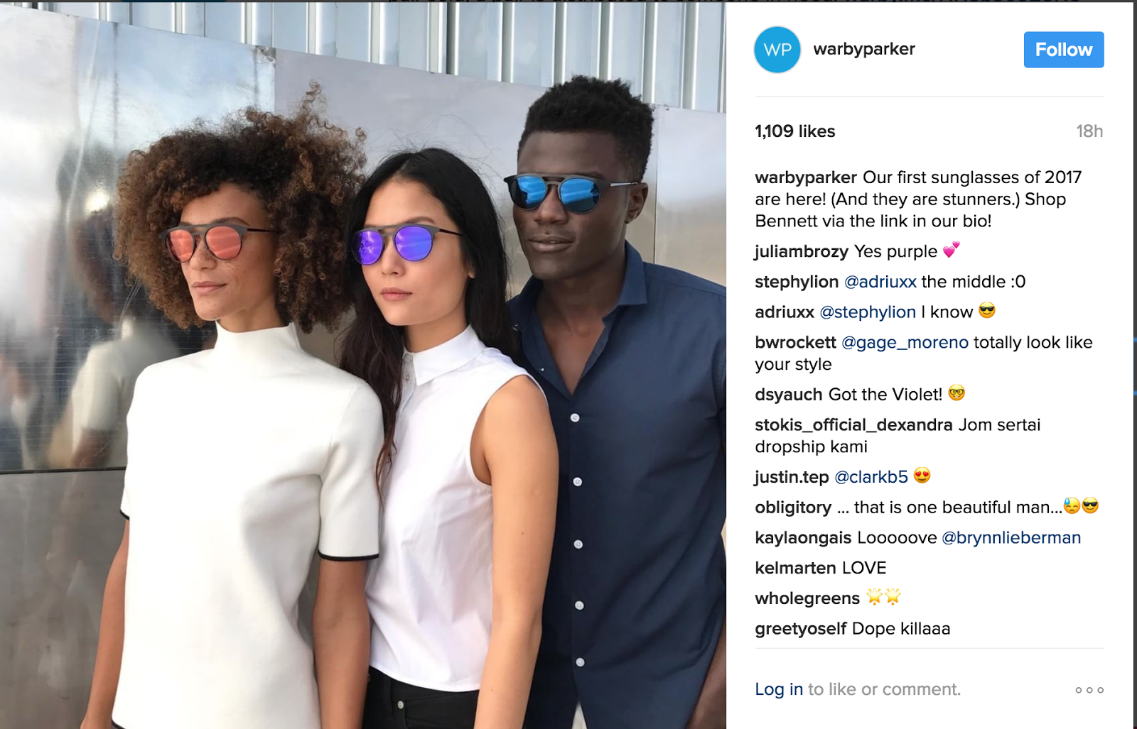
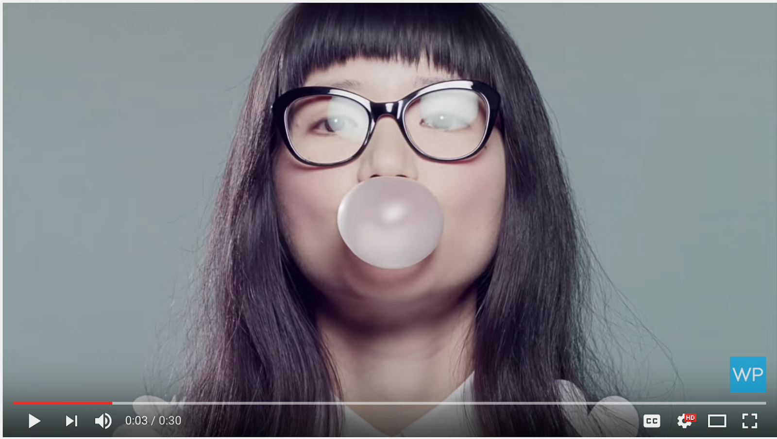
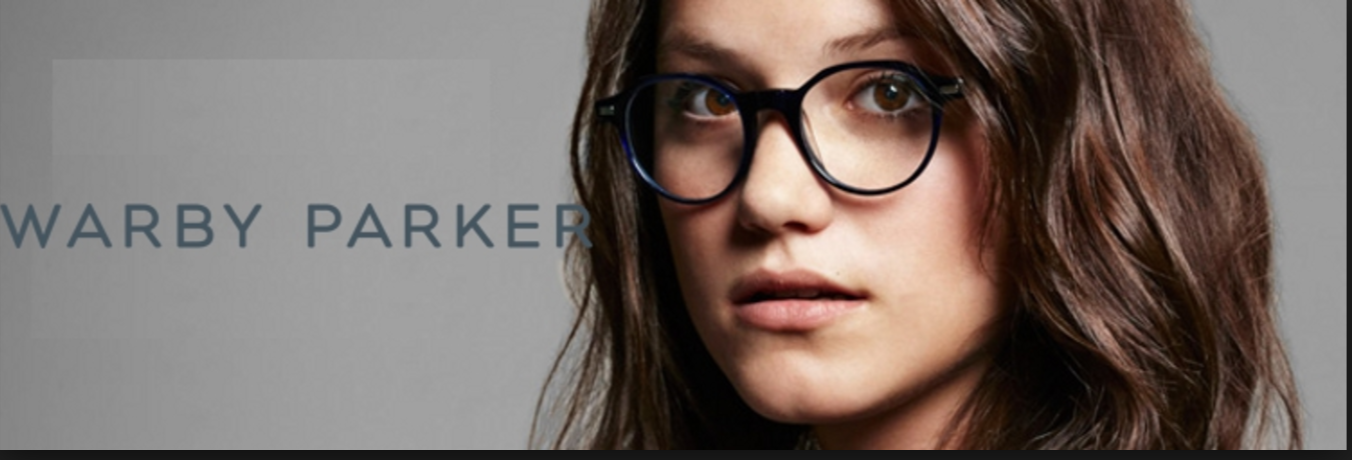
Warby Parker commissions up-and-coming photographers to create a very young and on-trend look for their advertising campaigns. Creating high-art portraiture with little or no text, they let their chic glasses make a statement. They use muted background colors and tend to use close ups and ¾ portraiture to keep the style of their ads consistent with the aesthetics of their lenses. Note the aloof poses of the people in the shots. This is, again, part of the overall brand aesthetic, which is geared toward hipsters in their 20s and 30s.
eRated
Up-and-coming tech company eRated uses minimal typography on abstract backgrounds to draw attention and stay on brand. The image itself isn’t their focus, but rather the overall tone the image provides. eRated strikes a balance between abstract imagery and minimal type, allowing the reader to absorb information easily.


In 2017, effective marketing is all about visual storytelling.
It’s about finding the right combination of powerful images and video with minimal and memorable messaging. Marketers and creatives need to select their brand voice carefully and then show it off to captivate and retain viewers to grow their business. Consistent color palettes, relevant content along with meaningful tone and appropriate typography is what makes for a memorable visual brand. When images are crafted well, viewers won’t even need a logo to know which brand they’re seeing.
Header image by Marili Persson.
