Community
6 Tips to Take Better Color Photos
By Lars - 7 min read

A guide to all the hues and how to capture them.
When the first color film came out, it was both a revelation and a revolution. After decades of shooting just in black and white, photographers could suddenly capture the world around them just as they saw it with their eyes. Thanks to color, photography became more predictable – and these days, we naturally assume that all photos we take are going to be in color.
While all that sounds great, color has also added some complexity: If the photo reflects what’s in front of you, boring scenes or dull settings will come out just unexciting as they are in real life. Color photos are realistic, and a bad one won’t selvaged by the elegant black and white tones of earlier days.
To take better color photos, you have to be attentive, selective, and to understand what actually makes a color photo stand out. We’ve put together this guide to show you how it’s done.
1. Capture colors, don’t fake them
Let’s begin with the most important lesson: Don’t assume that you can engineer colors after having shot your picture. Post production allows you to accomplish some pretty magical feats, but you won’t be able to turn a picture with boring, subdued colors into a true stunner. Simply put: Colors want to be captured, not added.
2. Work those colors
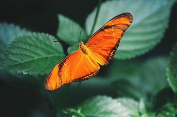
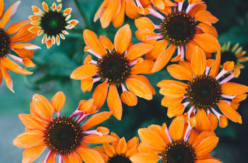
Most photos may now be color photos, but not all photos make use of the powerful effects colors can have. What often differentiates a good from a great color photo is the saturation or dynamic range of the shot. In other words, how vivid the colors are and how big of a color spectrum is visible. Even when a photo is dominated by just one color, having multiples shades of it in the frame makes it dramatically more interesting – and you can select for that when shooting.
PS: Don’t let the term dynamic range mislead you: There’s a difference between having a high array of colors in a shot and using the technique known as HDR (high dynamic range). Photos taken with the latter usually come out looking very exaggerated, showing that too many colors can indeed ruin a shot. A good photo should always look realistic.

3. Shoot at the right time
The term photography translates as “drawing with light.” The camera captures the light reflecting off surfaces around it, which in turn determines what colors are captured by the sensor (or film). Of course, light changes throughout the day: From the golden morning light to the harsh midday sun all the way to the Blue Hour and the darkness of the night.
As the previous sentence implies, some of those times are better for getting nice colors than others: Shooting at the beginning and the end of a day’s sunlight, you’ll find that soft light makes for richer colors.

4. Use colors accents
The Spanish movie director Pedro Almodóvar is said to have had a special obsession for a while: He tried including a red object in every shot of some of his movies. Almodóvar understood that while we’re surrounded by colors all day long, it helps to isolate a particular one in order to bring out their its vividness. He would film red cars driving across grey concrete, or place a red phone into a drab office setting. You can emulate this tactic by finding a neutral background and placing a colorful object inside or it. Or by simply keeping your eyes open for specific colors and try to frame your pictures in a way that isolates them.


5. Establish a color balance
Take a second to look at the following picture and think about why it works so well.
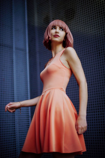
What the photographer has done here, is to create a great color balance. The peach tones of the model’s hair and dress, as well as her light skin tone work perfectly with the dark background. The blue, meanwhile, is a complementary color to the pink and emphasizes the shades on the model.
Not sure what colors work well together? Here’s a handy chart to consult.
6. Follow the seasons
Just as light changes during the day, the colors we’re surrounded with change with the seasons. Winter is dominated by subdues tones, but also by a soft light whenever the sun breaks through the clouds. Summer has a lot of sunlight, and is especially great for shooting early and late in the day. But the best part about the seasons is that each of them gives you a different color palette to work with: Think flowers and leaves, snow-covered landscapes or sparkling waves. Try to adjust your shooting behavior to what makes sense: Calm portraits by the window in fall light, images of nature when nature is in full bloom.
Consider the seasons a challenge for your photography: If you follow the natural turn of seasons, it feels as though you’re granted a new set of paints to work with every couple of months.
Header image by Earl Richardson.