Education
Professional Editing Secrets From EyeEm Photographer of The Year, Kate Phellini
By Guest Author - 5 min read

How you edit your photos can make or break your creative career. Our Photographer of The Year Kate Phellini takes us through her editing process step by step and shares the essential tips everyone should try out!
Kate’s visual language has always caught the eye of editors. So much so, that her unique style and creative talent led her to be honored with ‘The EyeEm Photographer of The Year 2019’ award at this year’s Berlin Photo Week.
Having started out in photography as a young girl, Kate understands the importance of learning one’s craft and nurturing opportunities for inspiration or creative experimentation. It’s these skills that have allowed her to “show those beautiful moments that we don’t notice in regular life“ that many of us often miss.
In this practical tutorial Kate shares the essential steps she includes in her editing process when creating her iconic color palettes and visual style using the new Luminar 4 software. So that no matter how close your next deadlines might be, you’ll be able to deliver the highest quality images every time.
Plus, a special offer is available for all EyeEm Creators: use the promo code - EYEEM2020 - and get Luminar 4 and a free Eyeem Creators Look Pack to try out Kate’s editing tricks!
Kate Phellini’s Ultimate Editing Tips & Tricks
When it comes to editing my photos, I’m always looking to discover new editing options and in turn an unexpected finished result. I shoot a lot and my goal is to get my images out to the client as quickly as possible without compromising on quality.
Of course every image is different, but there are a few tricks that I’ve picked up during my time working in photography. I want to walk you through my regular workflow and introduce my ‘holy grail’ tools & functions that I discovered through Luminar 4!
Why is Good Editing Important?
It is a great way of expressing your vision. You can’t always get the exact picture you have in your head without high-quality equipment or a very particular weather condition.
How to Edit Quickly When Faced With a Tight Deadline
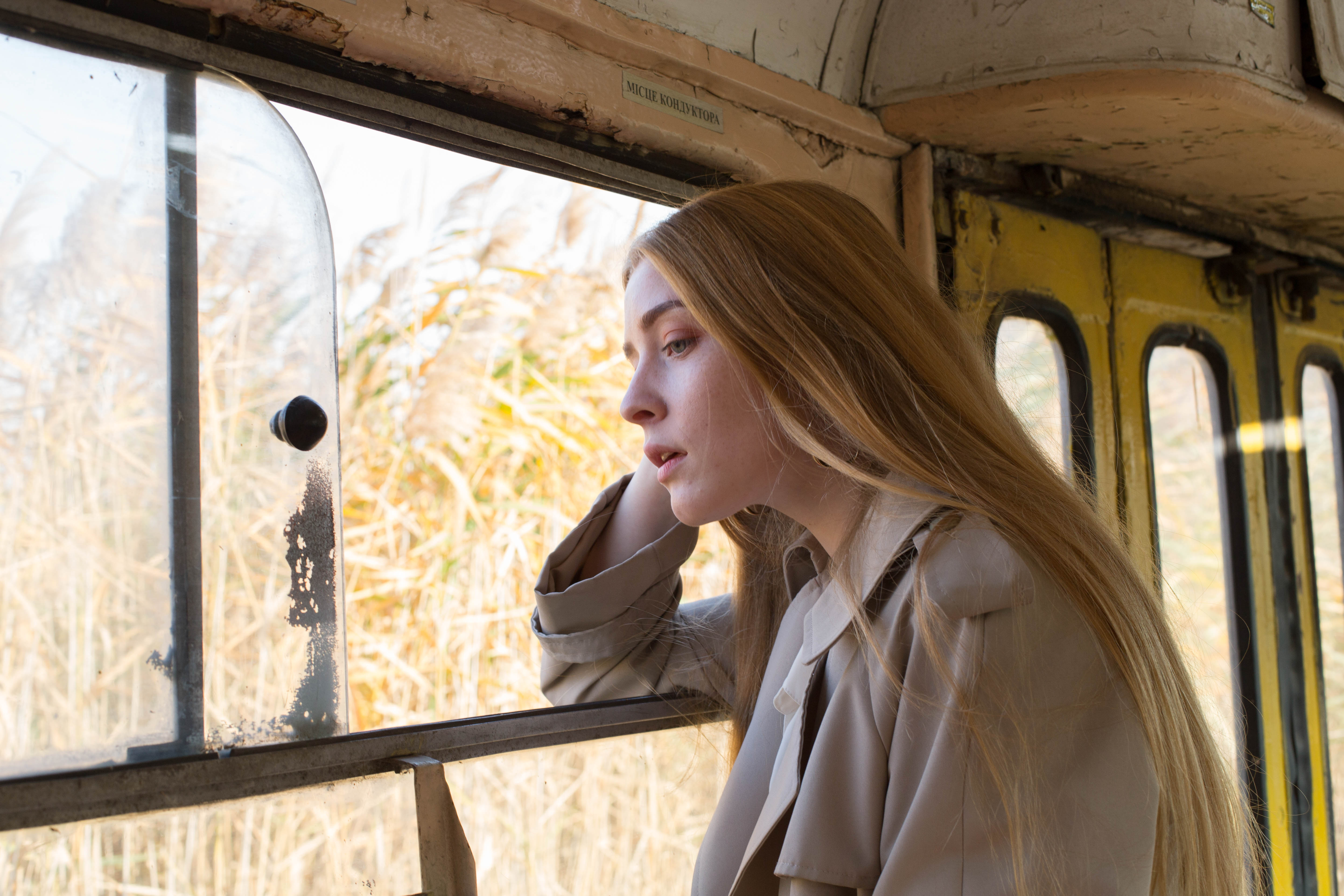
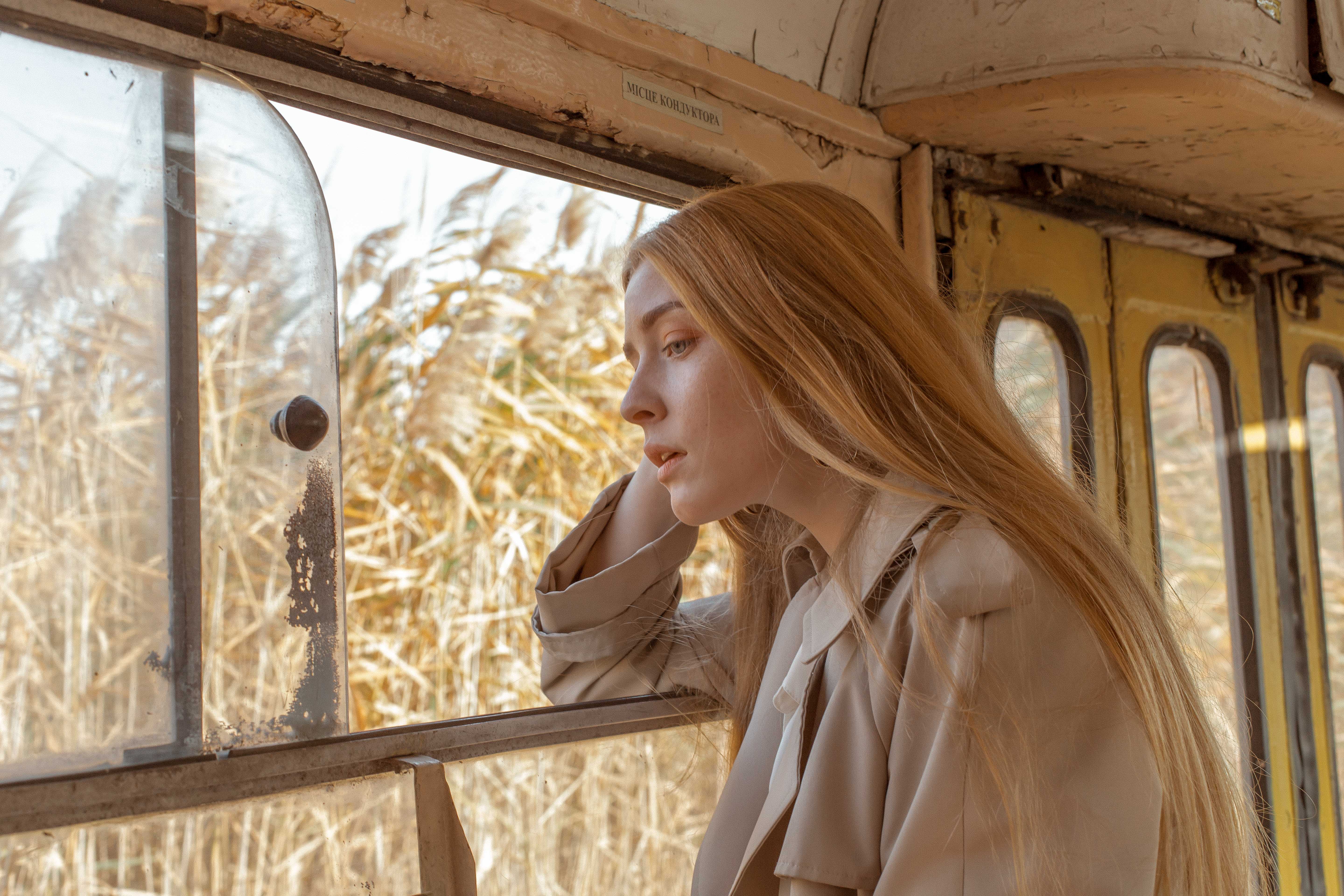
If I’m faced with a short deadline, the first thing that I would do is check the ready-made Luminar looks (certain presets or filters to use on your images). The ‘EyeEm Creators’ preset pack is my go-to set of looks and a real time-saver. I use them to discover inspiration for colour treatment or just as an easy way to edit my images when the deadline is tight - just like the image below which I used ‘AP — Warm Landscape’ to create.
It’s also a great way to make a particular shoot or photo series, as well as your wider portfolio and social profile, look consistent and keep you from jumping from one colour palette to the other. If I decide not to use those presets or I am starting out on a new, very specific project, I start creating my own look by following a few crucial steps.
Find Your Editing Workflow
Since my first time using Luminar software about a year and a half ago I’ve been including it in my photo editing routine. There are two ways I like using the newest version of Luminar 4 - either as a stand-alone application or as an additional step to my editing process (you can as well use it as a plugin for Lightroom or Photoshop).
Therefore, I either start with opening a single image in Luminar 4 or I do some pre-selection and pre-editing on other editing tools before exporting it into Luminar where certain processes can be sped up, improved and optimized.
Practical Steps: How I Edit a Photo
I like working in Luminar 4 in almost the exact order the tools are presented on the screen when in ‘Edit’ mode. On the right side of your screen you will see the following categories:
1. Layers
2. Canvas
3. Essentials Mode
4. Creative Mode
5. Portrait Mode
6. Pro-mode
Let me walk you through them one by one.
1. Layers
Layers is a general panel of the different layers you can create when editing the image. I recommend editing your images using this layering as it makes it much easier to control the final result.
Sometimes, after hours of staring at your screen your eyes might get tired and overdo on some features (I know that my weak side tends to be the dodging and burning process and I will tell you a bit later how Luminar allows me to fix this problem). The impact of each layer on the image can be adjusted by the opacity slider, layer transformation option, editing the mask option, or might removing it with the ON/OFF button.
2. Canvas
Canvas category impacts your original image framing. Apart from the usual cropping and rotation, it allows you to remove the deformations caused by the lens used, i.e. reducing the lens distortion and devignetting. Personally, I don’t mind lens distortions too much and even enjoy playing around with the effects. This being said, the devignetting function is a must for me. I dislike vignettes as it was not what I was seeing in the viewfinder and it’s not what I was capturing.
TIP #1: My suggestion is to leave out one Canvas option for later - the ‘Clone & Stamp’ tool. You’ll understand why in a short while.
3. Essentials Mode
This is the step I spend most of my time on. Here I work with the overall lighting of the depicted scene and its colours in attempt to get the look I had in mind when preparing for the shoot.
When it comes to editing my universal approach is to follow the natural colors, shadows, and highlights - only enhancing them where needed. This allows me to really see where the retouching is needed. Some of the flaws I’d prefer to remove might end up being hidden by certain shadows, get lit up, or affected by the change of color and it will no longer be necessary to get rid of them manually (meaning less work.)
Be mindful of your editing and never use high values of the sliders as it might look too extravagant or simply add an outdated feel to your images. Both the ‘Details enhancer’ and ‘Denoise’ tools in the Essentials category are extremely potent tools. When used excessively they might make your image look too grainy (and no, it won’t look as nice as a fine, almost velvet-like analogue grain. If you want this look I’d try the ‘Film Grain’ tool in the Creative Mode).
TIP #2: Take a step back (zoom out or click on the split view of the before/after effects at the top of your screen) every once in a while and check whether the image hasn’t transformed too drastically.
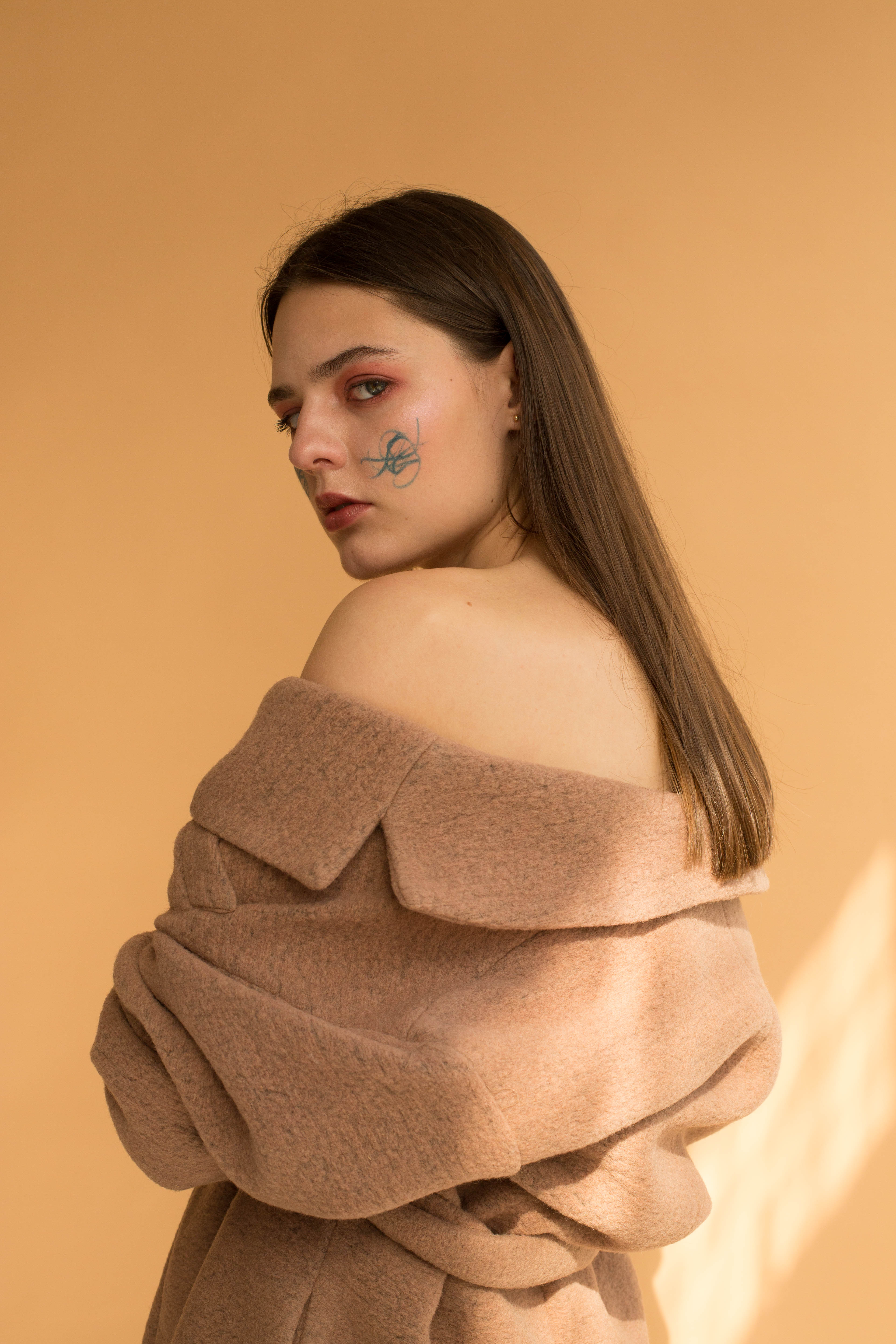
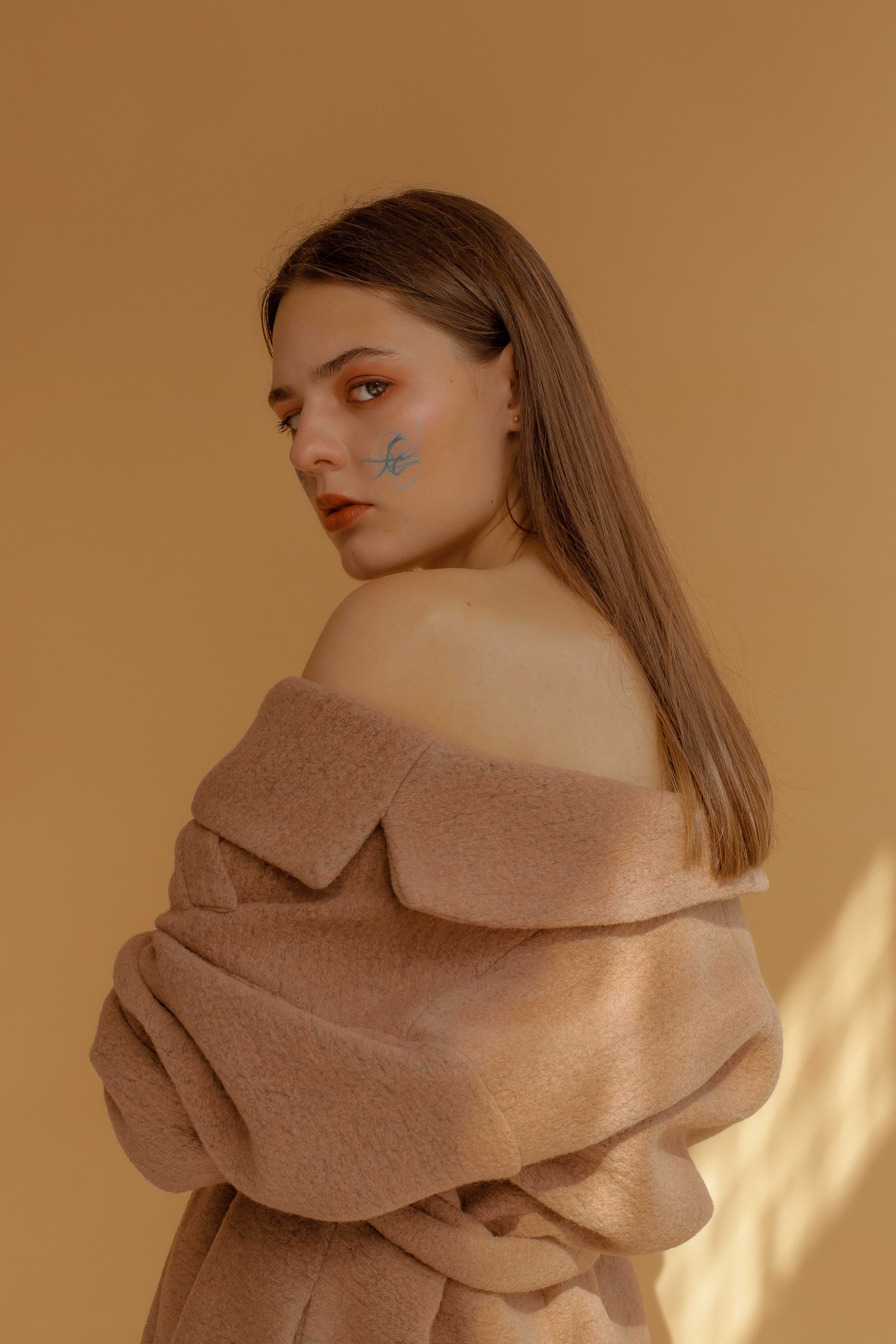
I enjoy monochromatic looks (i.e. a palette of shades of a single colour present in one image) and there are certain color tones that I usually find myself attracted to. For that reason, I always hit the ‘Advanced settings’ button and twist those colour a bit.
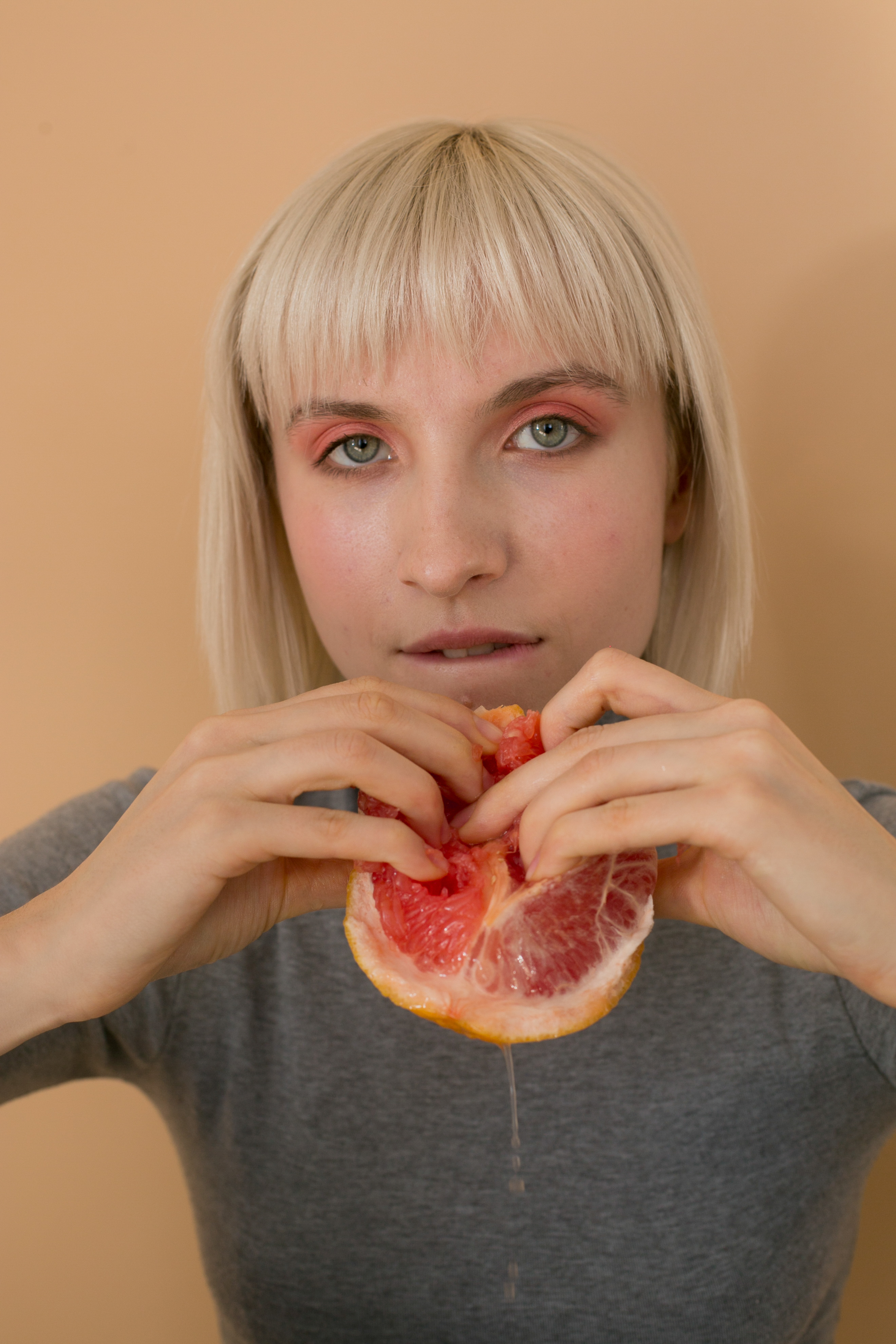
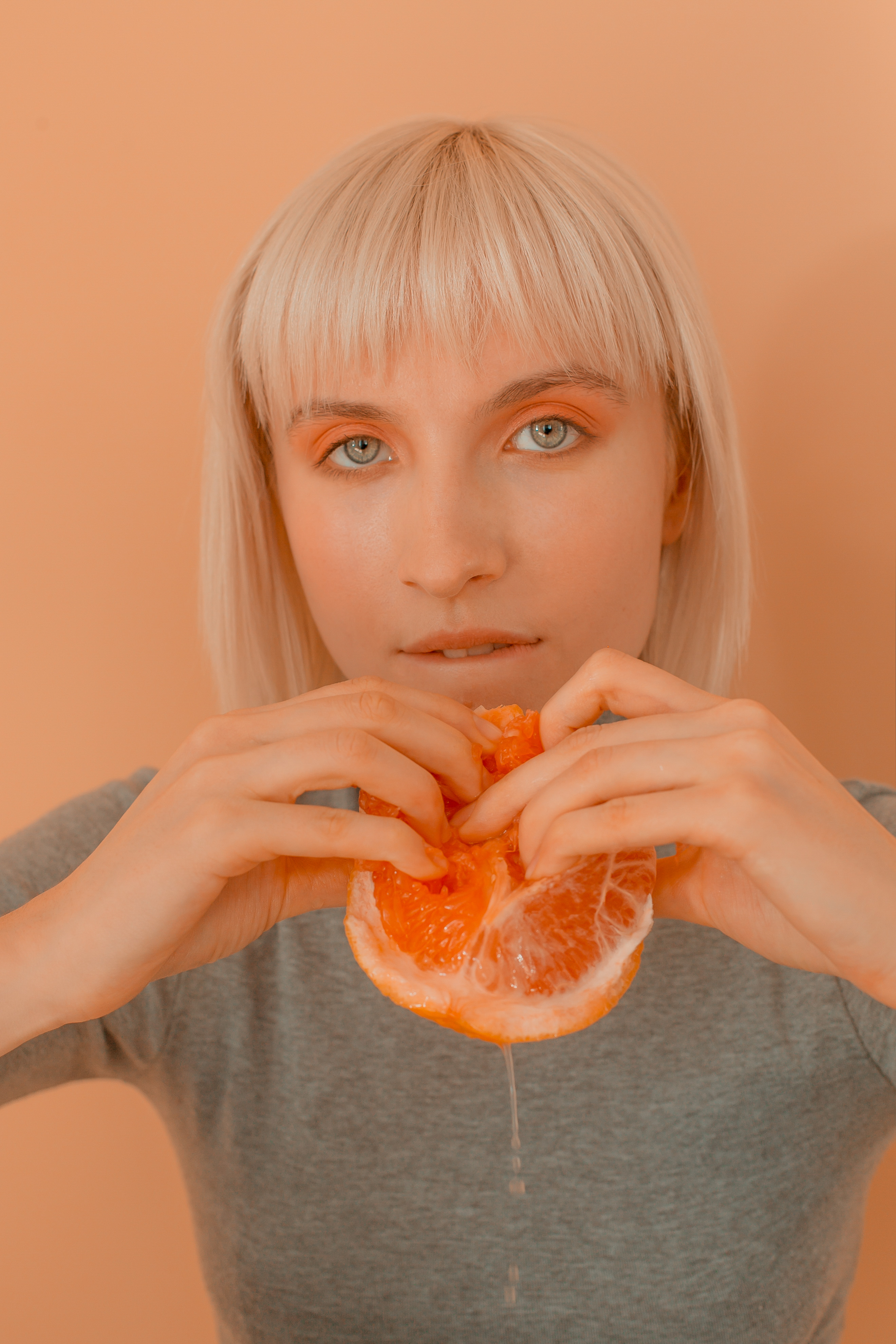
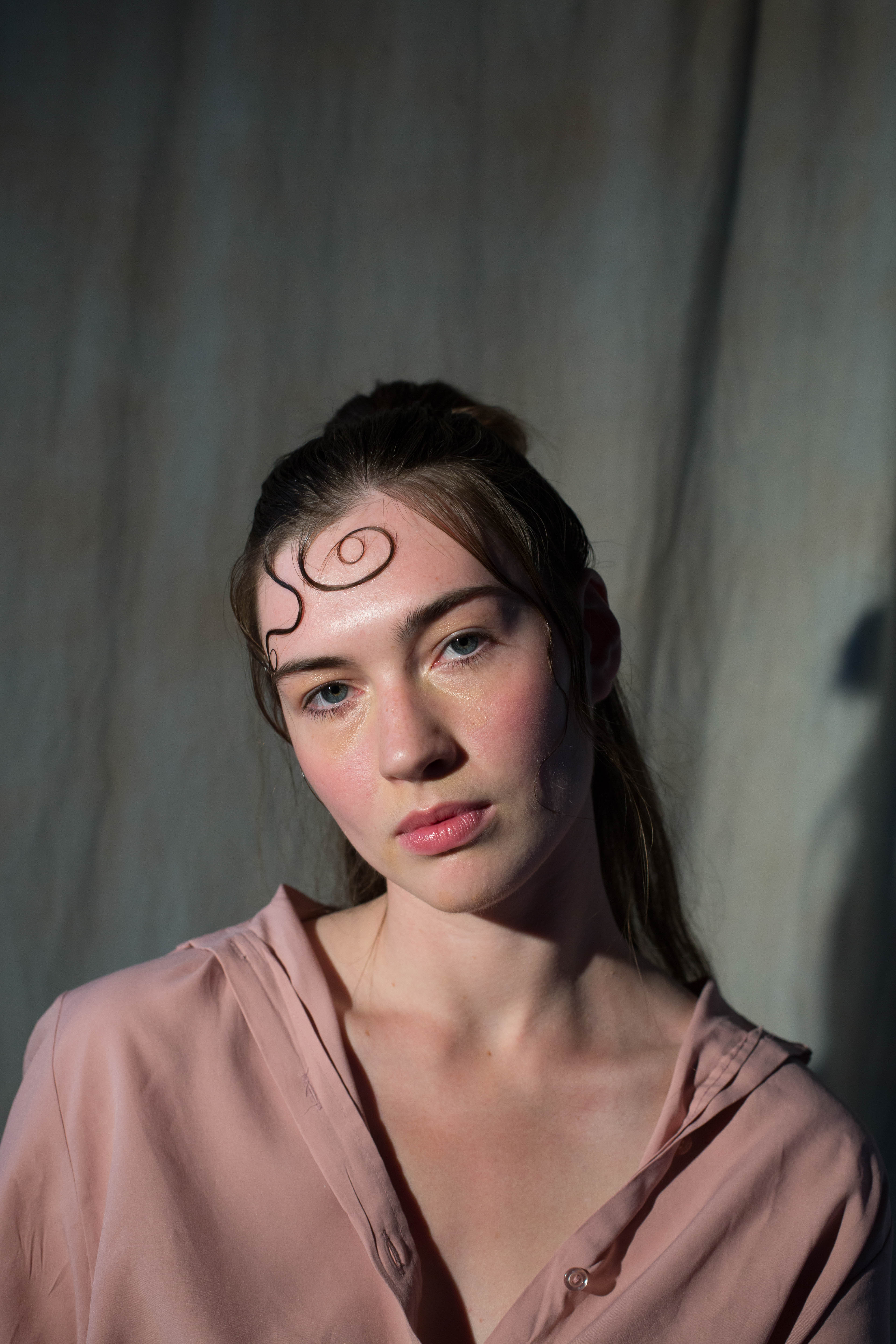
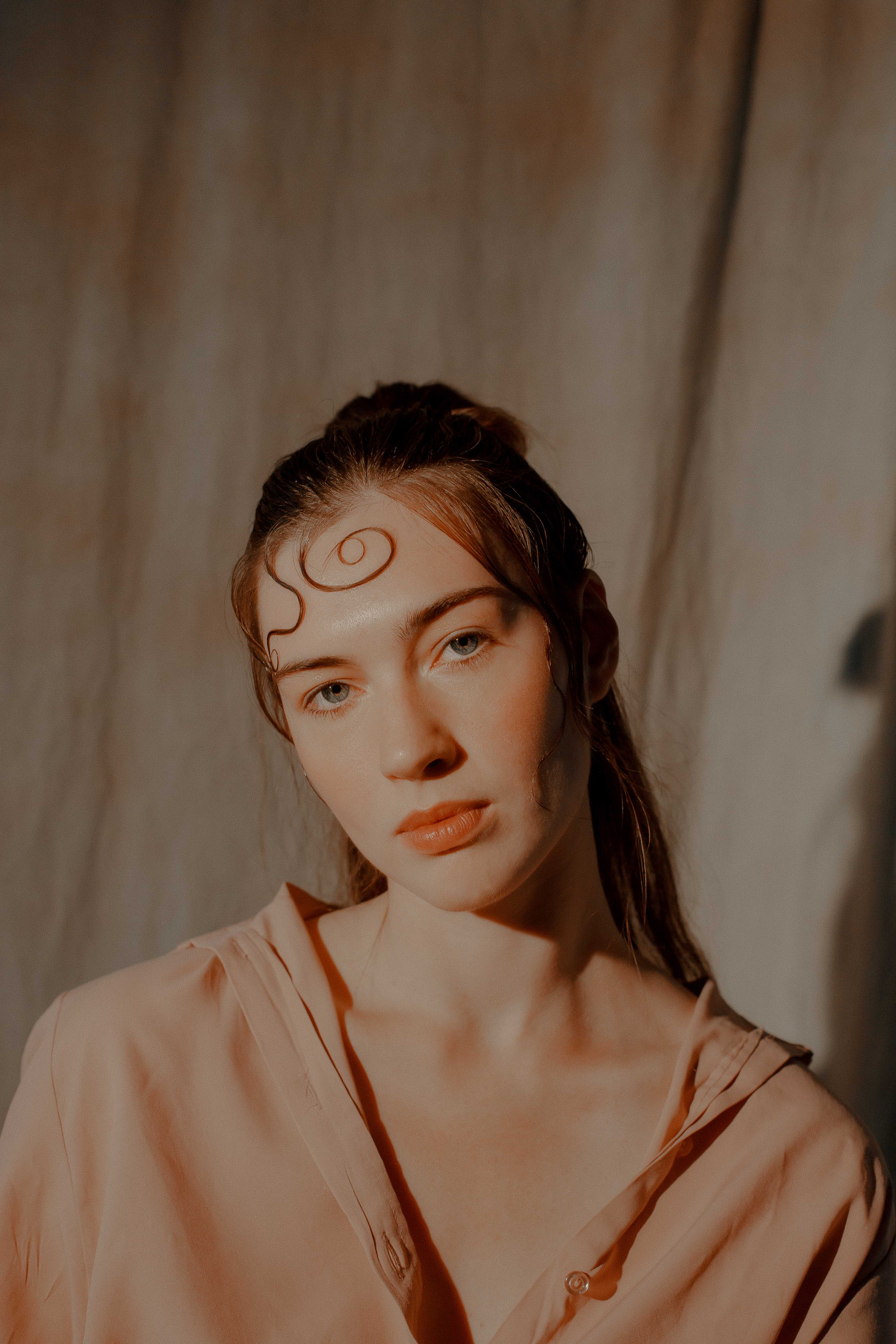
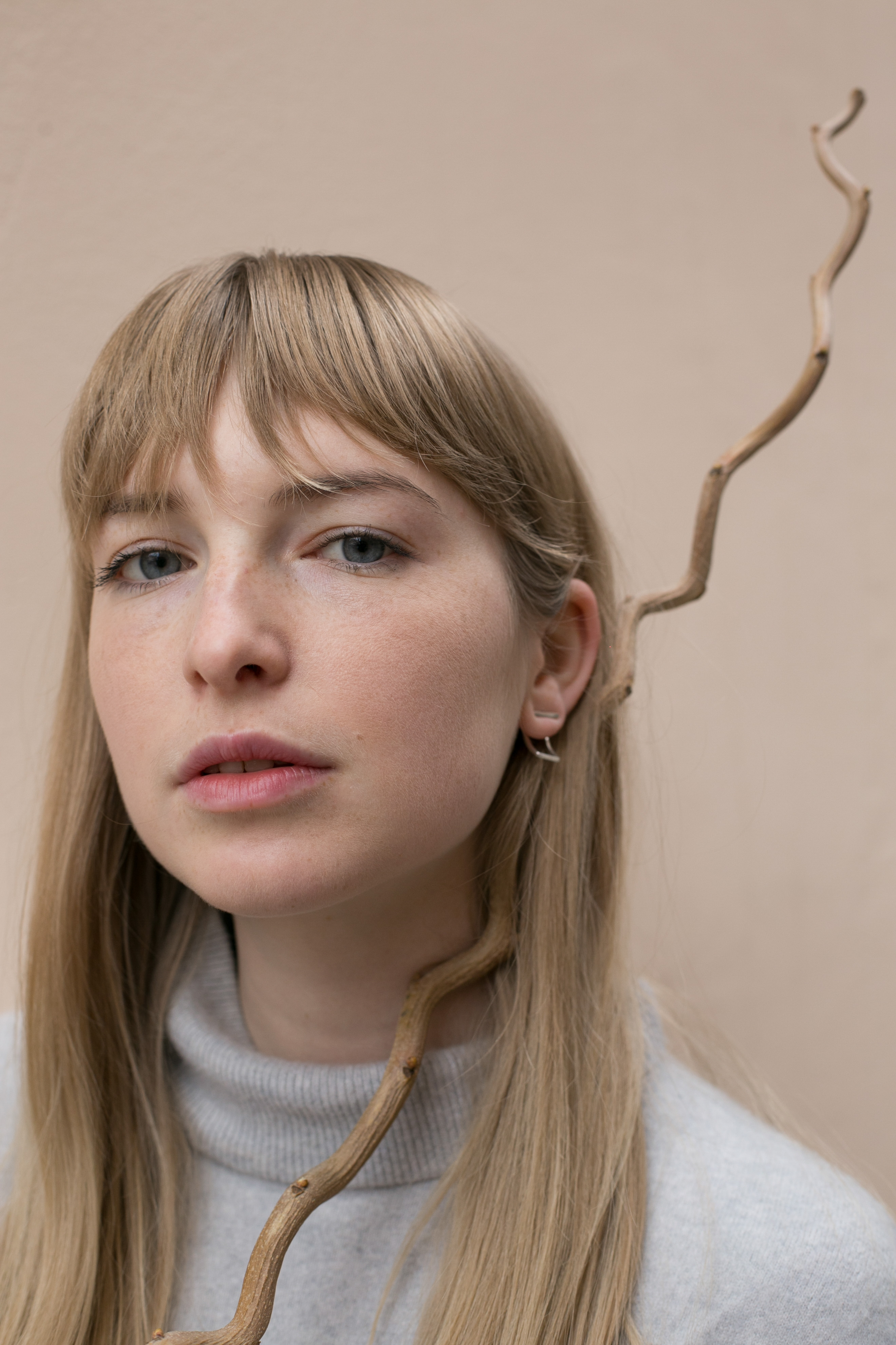
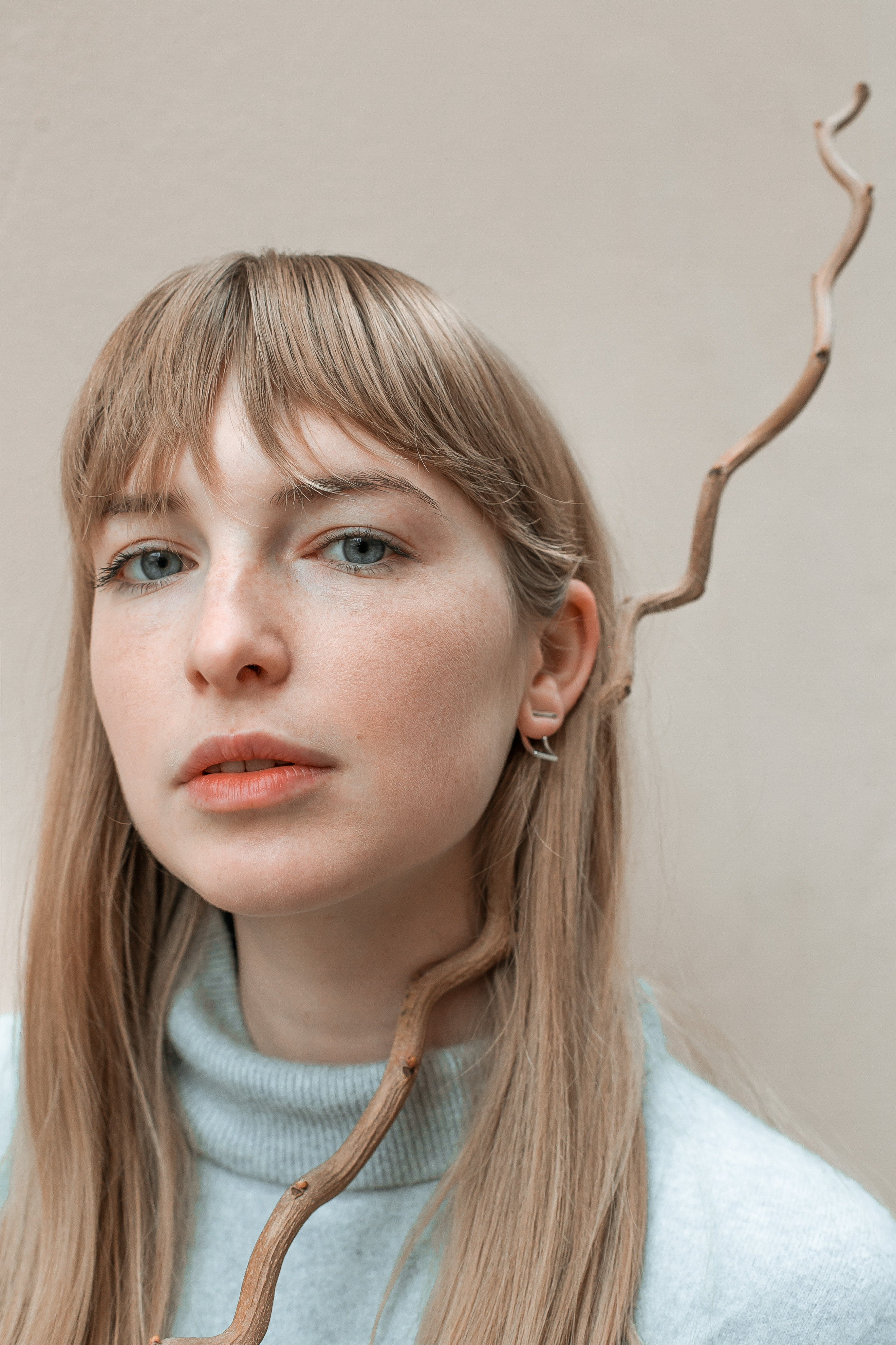
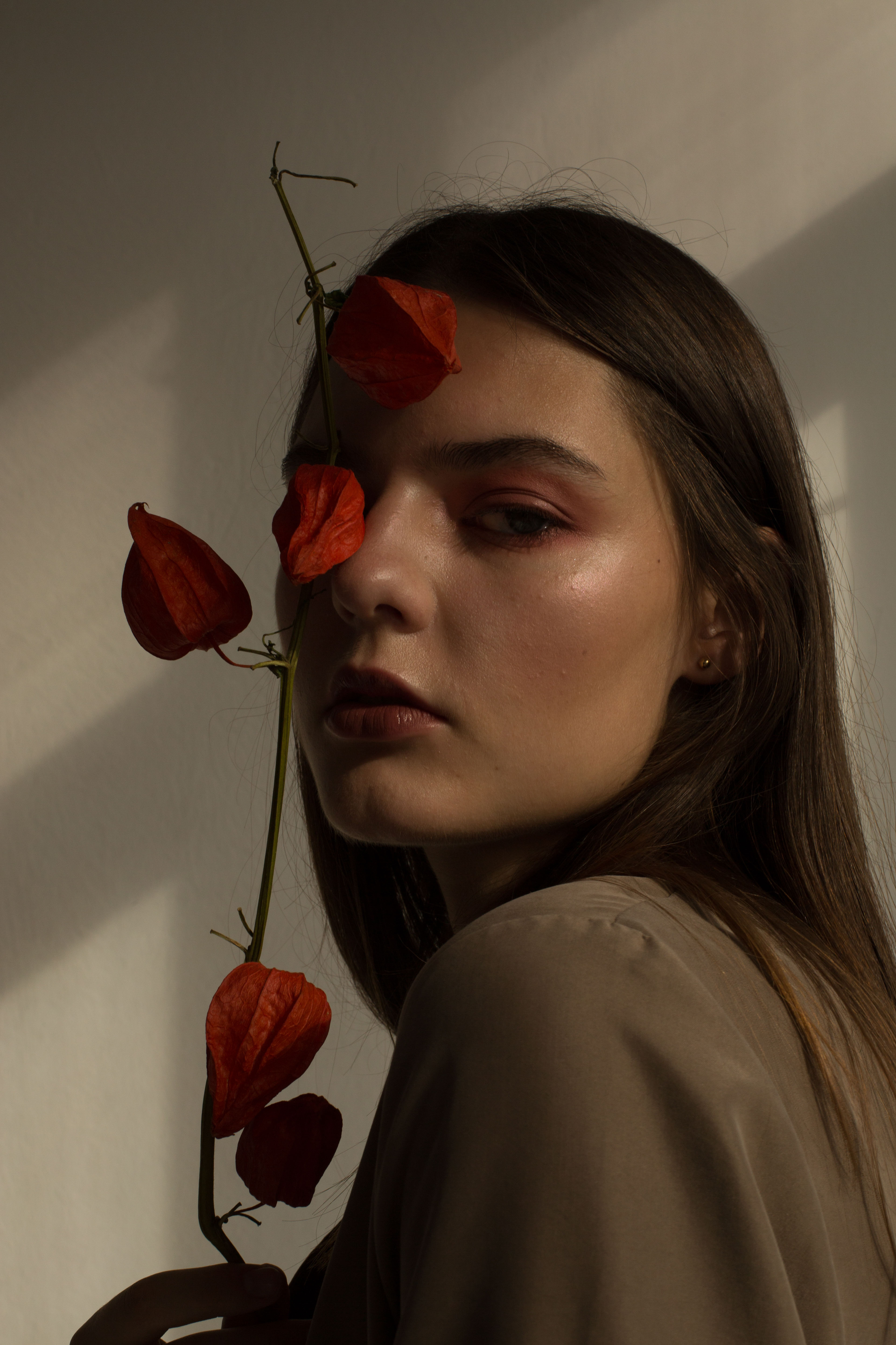
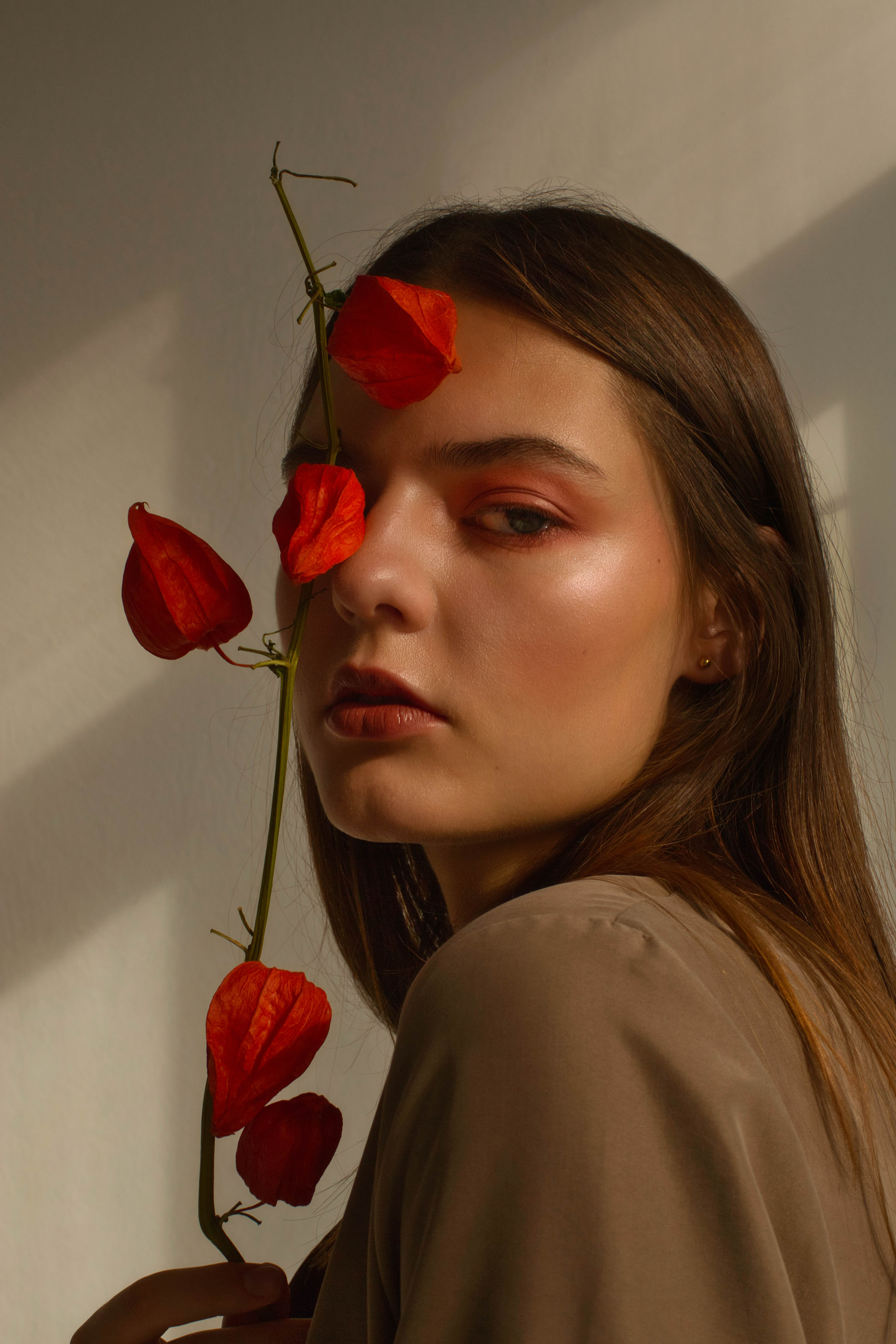
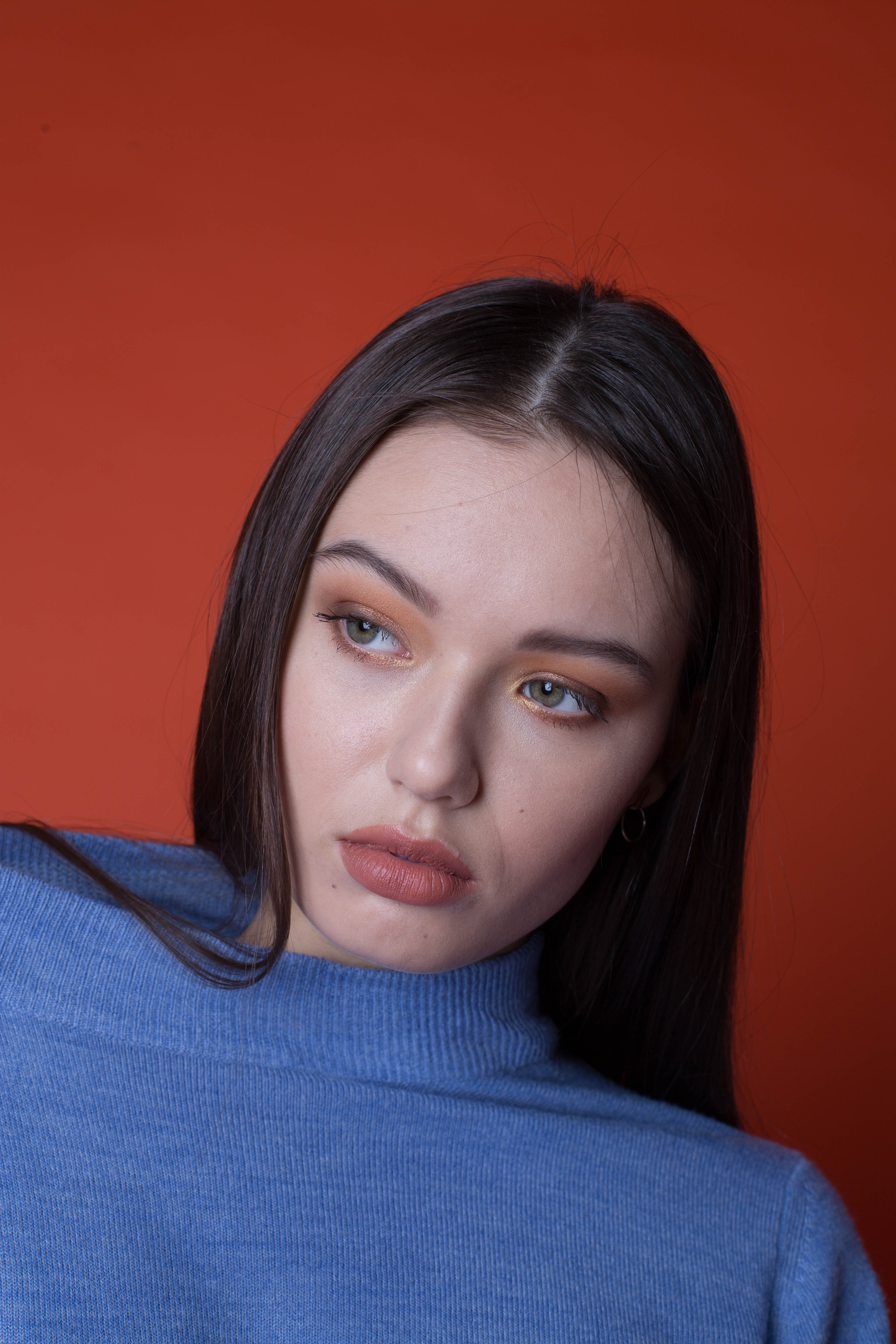
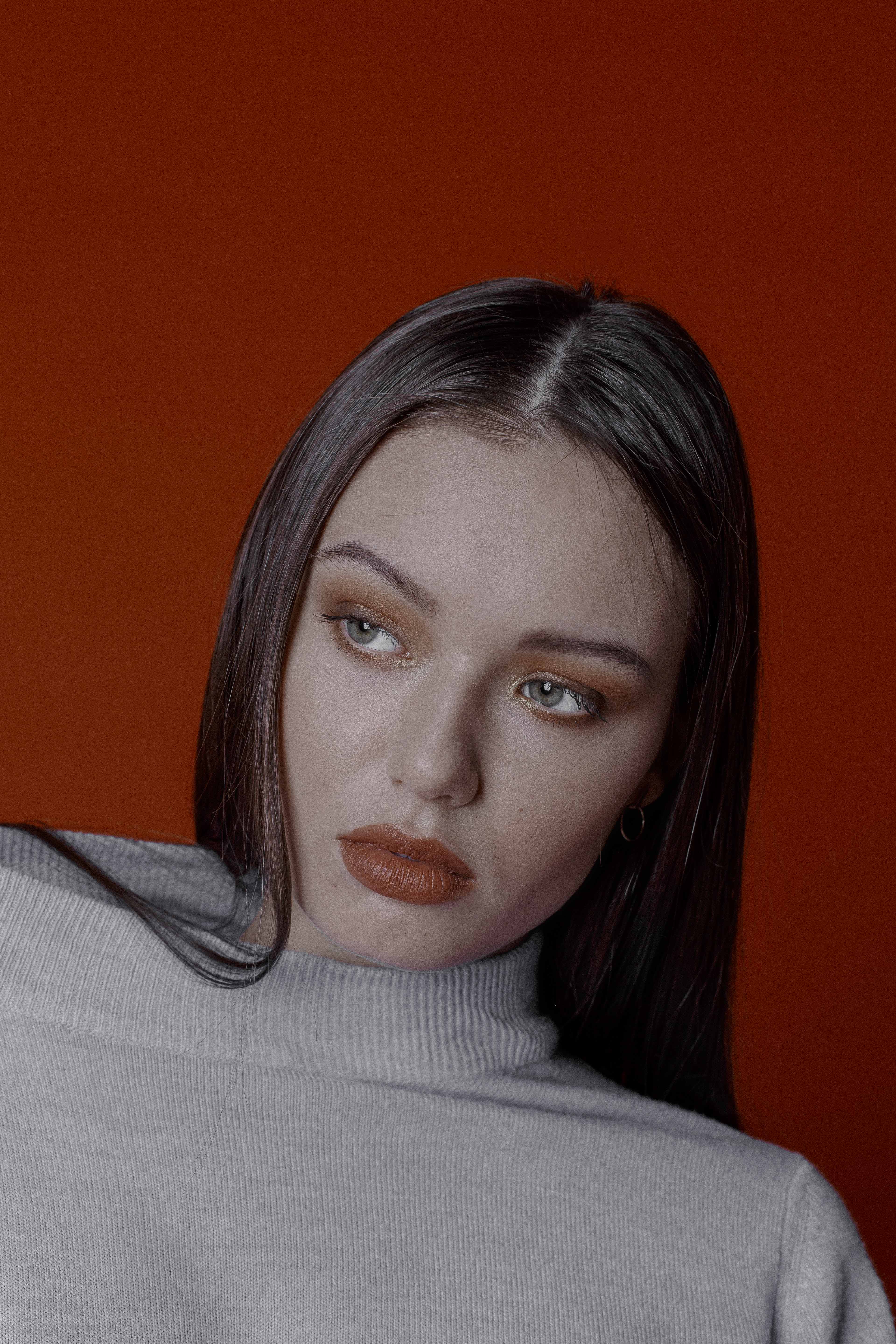
I often like gathering different colours to a similar tone. For example the image of Daria above - the yellows and oranges are shifted towards a similar tint and the blues and purples have been reduced. “Heating up” the imagecolors towards red makes them appear hotter, rustier like in these pictures of Olga and Angie (above).
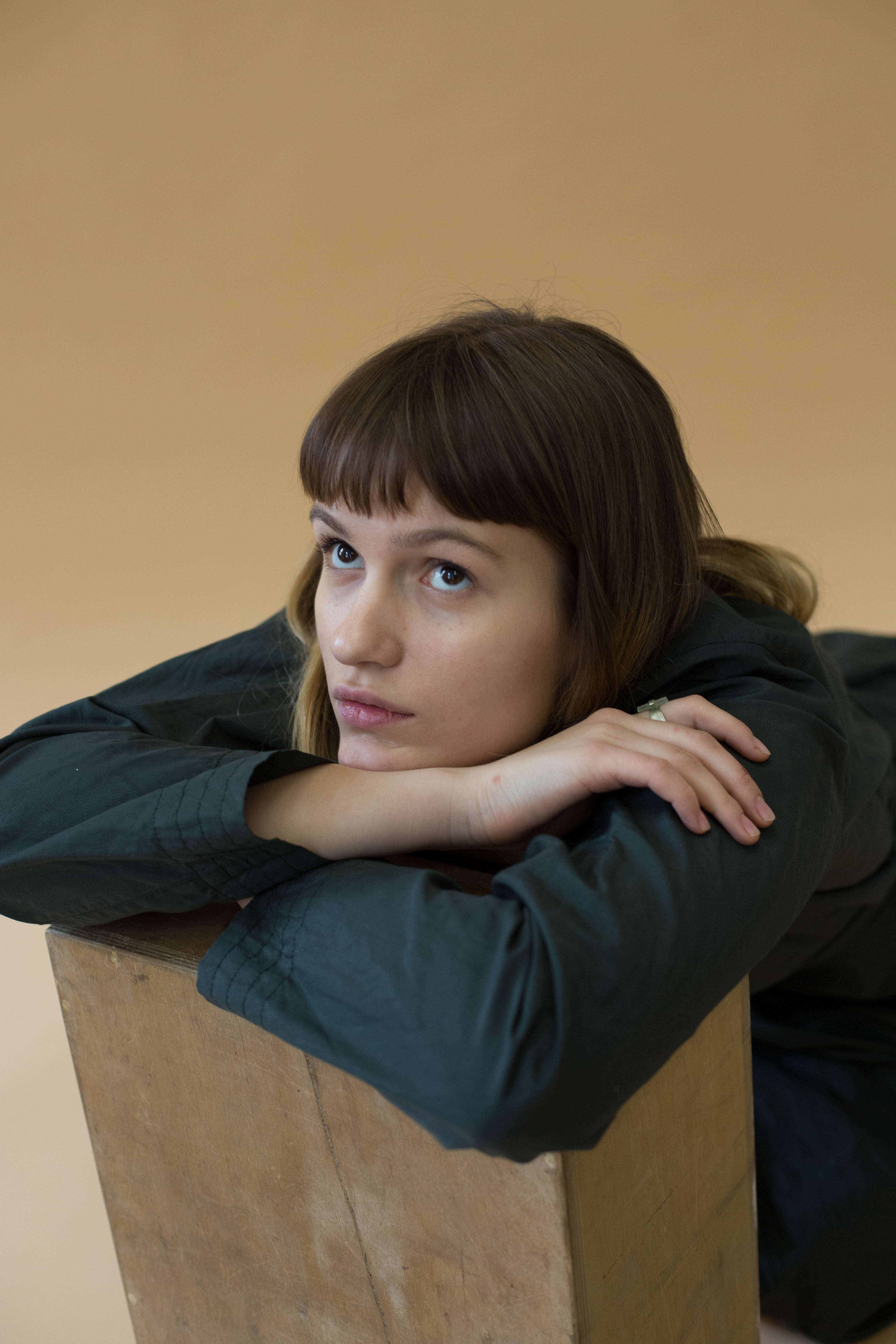
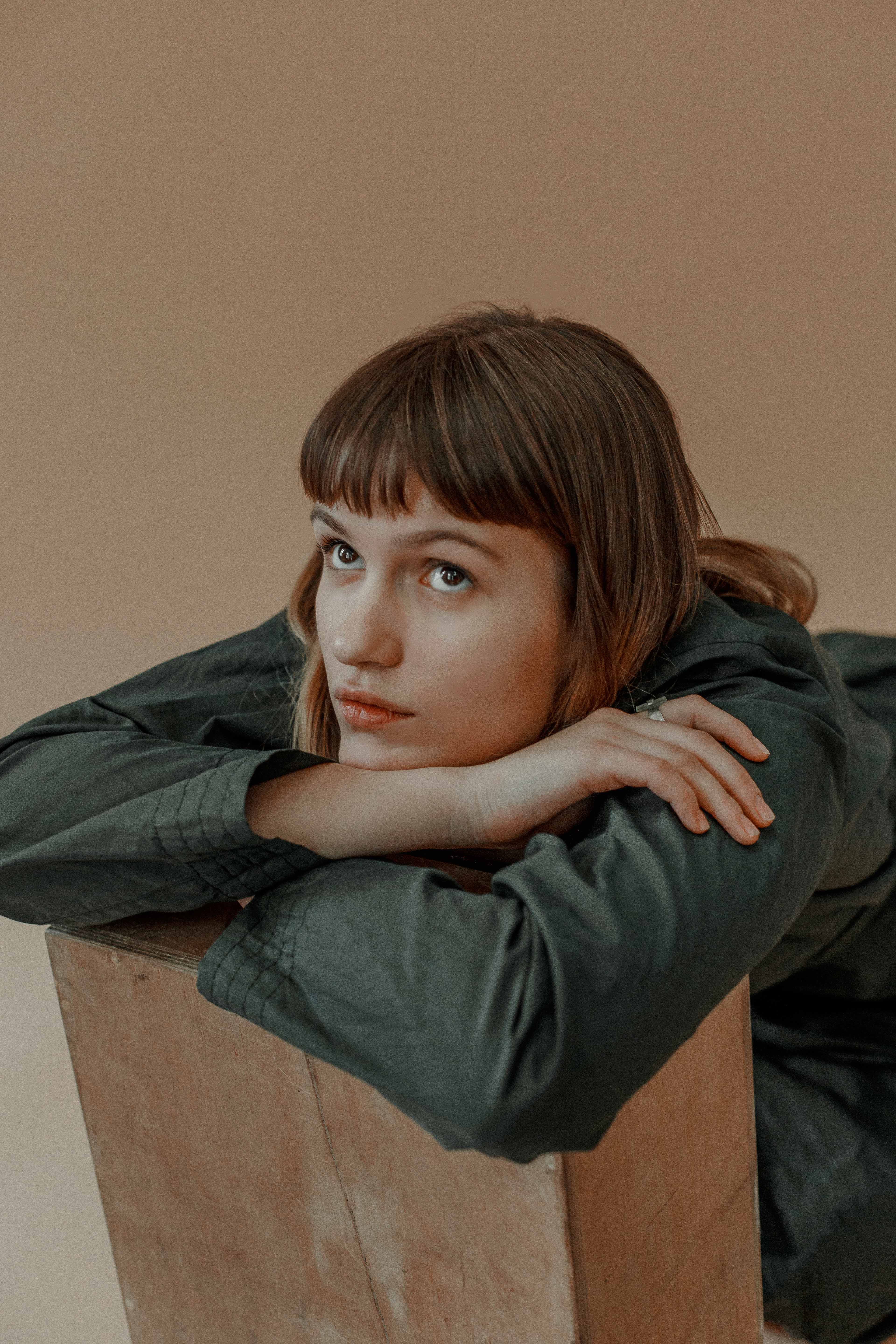
In comparison, bringing back the original green tint of the outfit picture of Dasha gave a very different finish.
Expert Trick: Try Removing Colors
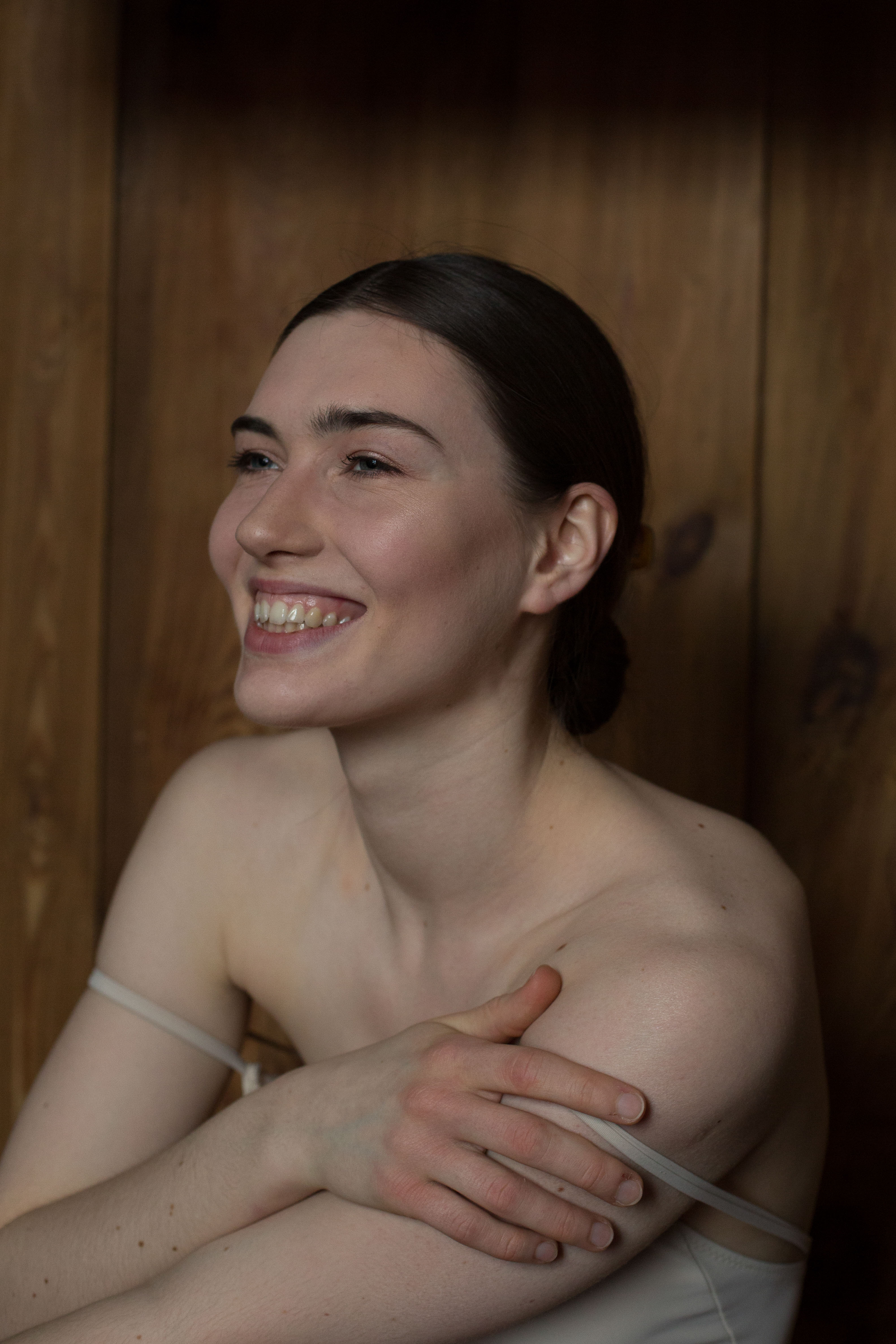
An interesting trick I like using from time to time is removing one or multiple colours that bother me from the palette of the image - for example this picture of Nicole (below).
I wanted to highlight the coldness of the model’s glance and the ‘cooler’ aspects of her beauty. The outfit she wore was blue - but I thought that cold, almost sterile, white would work better. Her eyes still have this hint of cooled down colour and the attention is drawn towards her facial expression and features rather than to a distracting strong colour contrast of red and blue.
To play around with this feature you shall go to the Essentials panel and click on the ‘Colour’ folder; choose the ‘Advanced settings’ mode and find a colour you would like to desaturate.
4. Creative Mode
Creative is indeed a panel you can express your creativity with. There you will find many tools to play around with, inspire yourself for some bold decisions and find that unique look of your shoot.
‘Colour Styles’ (LUT) is the folder I click first, as it is another set of creative colour treatment ideas (somewhat similar to the “Luminar Looks”, though only impacting the colours). You might even go crazy and enhance the boring sky of those grey winter days with the ‘AI Sky Replacement’ tool. Alternatively you might want to try the ‘Texture Overlay’ option to get a multi-layering effect.
5. Portrait Mode
I swear by “AI Skin Enhancer” and “Portrait Enhancer” tools. These two sets of sliders have saved me hundreds of retouching hours. There is no reason not to let the AI do your job instead of you, go click that “AI Skin Defects Removal” and just correct it where necessary clicking ‘Edit mask’ button (although I must say this is the slider that is extremely smart and advanced, thus I rarely correct it.)
You shouldn’t be afraid to use high values for this tool as you can trust the subtlety of this tool. Basically “Portrait Enhancer” is a set of smart tools working super-fast and with great precision on improving the look of human faces on your images. You’ll no longer need to go to a separate program to light up the face, whiten the teeth, remove dark circles and even slim down the face. A couple of sliders’ moves and you are done.
Always use the method of piling up. It’s better to be careful and to layer your subtle adjustments than to zoom out and see a plastic face. Work with low values and add up a slight bit if needed and preserve the natural skin textures.
If by that time you are still dissatisfied with the result, just hit Cmd+J on Mac (or Ctrl+J on PC) and open the above mentioned ‘Clone & Stamp’ tool. It works wonders. Go bit by bit around the image cleaning up the annoying spots (dust, flyaway hairs, pimples etc.). With a precise adjustable AI-powered brush it’s a matter of minutes at most.
Remember! zoom in on your image (150-200% is usually quite enough for a high-quality retouch), make your brush really tiny (around 12-15% works best) and work zoomed out to ensure the overall impact is good.
TIP #3: The Orton Effect is a lovely tool to add a softness to your image, and it might work perfectly well for a female close portrait or a cinematic street scene. However, that’s also a tool that might be ultra potent and can destroy your image so don’t over do it!
6. Pro-mode
Regardless of your experience level, don’t be afraid to try out the pro tools panel. There you’ll find the highly useful ‘Dodge and Burn’ tool. With this option you can deepen the impact of lights and shadows in an almost analogue, darkroom-like way.
Again, I’d be cautious of using high values with this tool. 3-5% of both lightening or darkening brush is more than enough. Luminar Layers let you pile up the effects gradually and lessen the ‘Overall Amount’ (opacity). I’ve found that you can get really into the process of dodging and burning and end up overdoing it.
Remember! Trace the natural lines of shadows and highlights you’ve created while capturing the image. Adding a bit of shadow can work wonders on shaping the body and carving out the muscles, plus adding highlights can make your image appear almost three-dimensional.
Finishing Details: When Do I Know A Photo is Ready
At the end, I always copy the adjustments that I made to a single image and create a name for a new look that can be used for the rest of the images in a sequence as well as adjusted and applied to a different project somewhere in the future.
What’s The Best Way to Learn How to Get More Confident at Editing?
Trial and error
Making mistakes and correcting them is the best way to learn.
Analyze other photographers’ work
Not copying or replicating - analysing. Define the colour palette of the image. Look for the clues of the light set-up the author used to create that image. It can usually be seen either in the eyes of the model or in the quality of lighting. Try asking yourself those questions while looking at the image that interests you:
1) Where is the light source? 2) How many light sources are there? 3) Where are they positioned? 4) What is the quality of light (natural light, artificial/studio light, the shadows are soft, sharp, no shadows present etc.) 5) What is the colour of the light? 6) What are the probable modificators used over the light sources? 7) Are there any reflectors?
Analysing the works of art if your goal is to mimic a certain style or an epoch. Ask yourself the same questions that I’ve mentioned above.
Utilize Learning Resources
Use YouTube tutorials and offline workshops to refine your editing skills and learn your workflow.
Examples of Great Edits:
Carlota Guerrero – natural pastel colours, natural skin textures, though still edgy and contemporary looking + interesting tricks using Liquify function.
Leslie Zhang – photographer’s natural Asian aesthetics, bold experiments with colours and colour contrasts, an example of being consistent while making every shoot look unique.
Viviane Sassen - an example of making the image appear more graphic and poster-like by creating a negative space with deepening the dark shades.
Crowned EyeEm Photographer of The Year 2019 at Berlin Photo Week, Kate is our ambassador for the coming year. See more of Kate’s outstanding work and be inspired by her EyeEm Profile or see her stunning official website!
Test out Kates editing tips and tricks with the new Luminar 4!
Plus, a special offer is available for all EyeEm Creators: use the promo code - EYEEM2020 - and get Luminar 4 and a free Eyeem Creators Look Pack to try out Kate’s editing tricks!