Visual Communication
Meet the Insurance Brands That Use Creativity to Succeed
By Laura Box - 5 min read
Through innovative imagery and original branding, these are the insurance companies that have used creativity to come out on top.
Poor customer experience and outdated design are plaguing the insurance industry, especially in the old-school legacy companies. This issue is so significant that entire start-ups like Hi There have been created with the sole purpose of helping legacy insurers modernise in order to avoid obsolescence. This is a slow process, so in the meantime, disruptors have been left with the perfect playground to creatively shake up the industry.
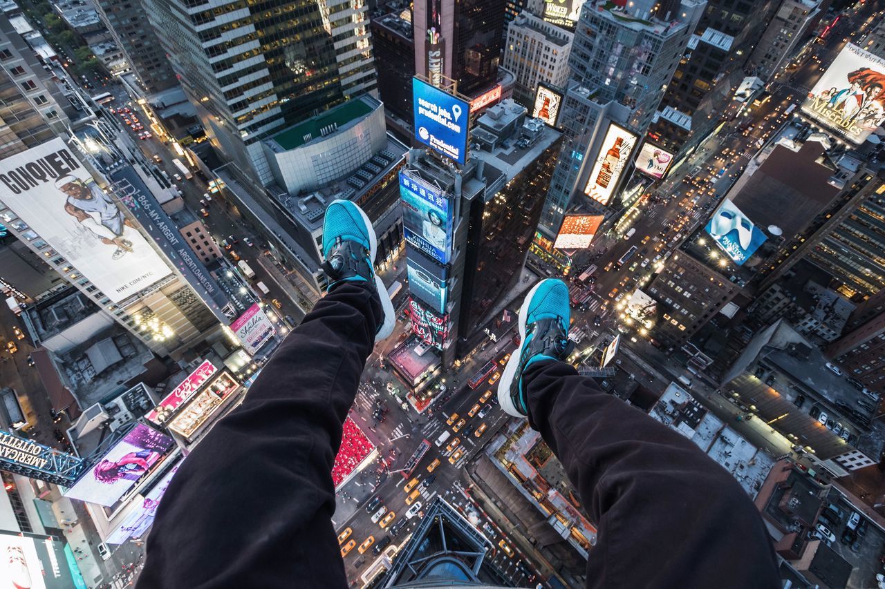
Jetty
With bright block colours, slick graphic design and well-written copy, Jetty’s brand certainly reflects a certain tech-savvy start-up vibe. When visiting Jetty’s website, consumers are intrigued enough to keep scrolling, and ultra-modern imagery sporting pops of their signature turquoise becomes the first taste of Jetty’s creativity.
Their product is just as creative according to Trilogy Real Estate Group’s COO: “Jetty’s great design and technology is what initially caught my eye, but it’s the quality and innovation of their new take on the security deposit replacement that I think will be of great value to multifamily operators”. This goes to show the importance of creative visuals for capturing a market – in this case, the consumers who want their insurer to be at the forefront of technology – and using these visuals to reflect the product your brand sells.

Oscar
When you enter Oscar’s quote tab, big words immediately fill the screen: “My zipcode is…”, customers are inclined to type in their zipcode. On the Oscar website, the next two screens ask for income and age, and moments later multiple health insurance quote options fill the screen. With many insurers, it can be difficult to find prices, and often customers need to wait a while for quotes.
Oscar creatively simplifies this time-consuming process to create a user-centric website which immediately provides what people are there for. By developing a user-centric website, Oscar’s visuals are simple, and don’t overwhelm visitors with copious text. Be careful though; if your brand tries to replicate this, it can be frustrating if done wrong – users don’t want to struggle to find the details

Raiffeisen life Insurance
Russian insurer Raiffeisen uses a curated mix of rational and emotional imagery to gain the trust of their customers. But that alone didn’t help them win clients. Rather, their fresh, welcoming and well-designed website, which keeps user experience at the forefront allowed for easy use contrasted strongly with the slightly more outdated competitors in the Russian life insurance market.
This modern simplicity bodes well for insurance companies: if it’s easy to use the website, easy to connect with customer service and all the information is readily available in a simple format, it demonstrates to potential clients that the entire insurance service will be easy to use.

The Insurance Experiments
UK enterprise The Insurance Experiments wants to let consumers know that insurance doesn’t have to be boring. By creating a set of quirky animated scientists to answer various questions about insurance, they aim to take the myths and confusion out of the industry. While the company doesn’t actually sell insurance – rather, they help consumers understand more about it – the transparent education wrapped up in a comical and cute package is appealing, and insurers could learn a thing or two.

Swiss Re
One of the most successful international insurers, Swiss Re has used their elite standing in the industry to visually position themselves as a chic, stable and serious competitor. By staying competitively up to date with their website design and imagery, Swiss isn’t allowing their status as a legacy provider impede their reputation. In order to do this, they’ve employed high-quality, futuristic visuals, a website that displays recent insurance related news and an array of reports on their home page, helping to immediately establish their position as a source of industry news and information to visitors.

Summary
Sign Up For Fresh Inspiration
Click here, if you want to read about more great ideas for your brand and sign up to our regular newsletter to be notified of all the latest and greatest creative and visual insights for your business.