Visual Communication
How to Rethink Your Photo Production, Not Your Campaign
By Jonathon Davison - 3 min read
Despite the current global context putting photo productions on hold, your campaign can still go on. We spoke to our visual lead to find out why our new image collection is the ideal replacement for achieving that premium, highly curated look in seconds.
Due to our global network of photographers and creatives, we’re still able to run our custom photoshoots. However for many, access to full-scale photoshoots has become difficult during this time. However, that doesn’t mean that you have to compromise on your brand’s strong creative practises.
We sat down with EyeEm’s Visual Lead, Jonathon Davison, to find out why licences images from our new graphic image collection might be the best move for your brand. We discuss why these images are relevant for every industry, how to you should use them, and how sometimes more ‘whitespace’ can be more powerful.
Make Sure Your Summer Campaigns Aren’t Cancelled
Huge campaign initiatives might be off the table but our image experts have pulled together a collection of photos that can mimic the look of a full photo production. So despite the current disruptions to your current campaign, there’s a number of ways you can still get your message with an equally strong impact and still meet tight deadlines.
See the full image collection →
Why is this collection important for brands at this time?
This image collection is easy to work with and provides clean messaging - both of which are essential at a time when global disruption and travel delays presents certain challenges.
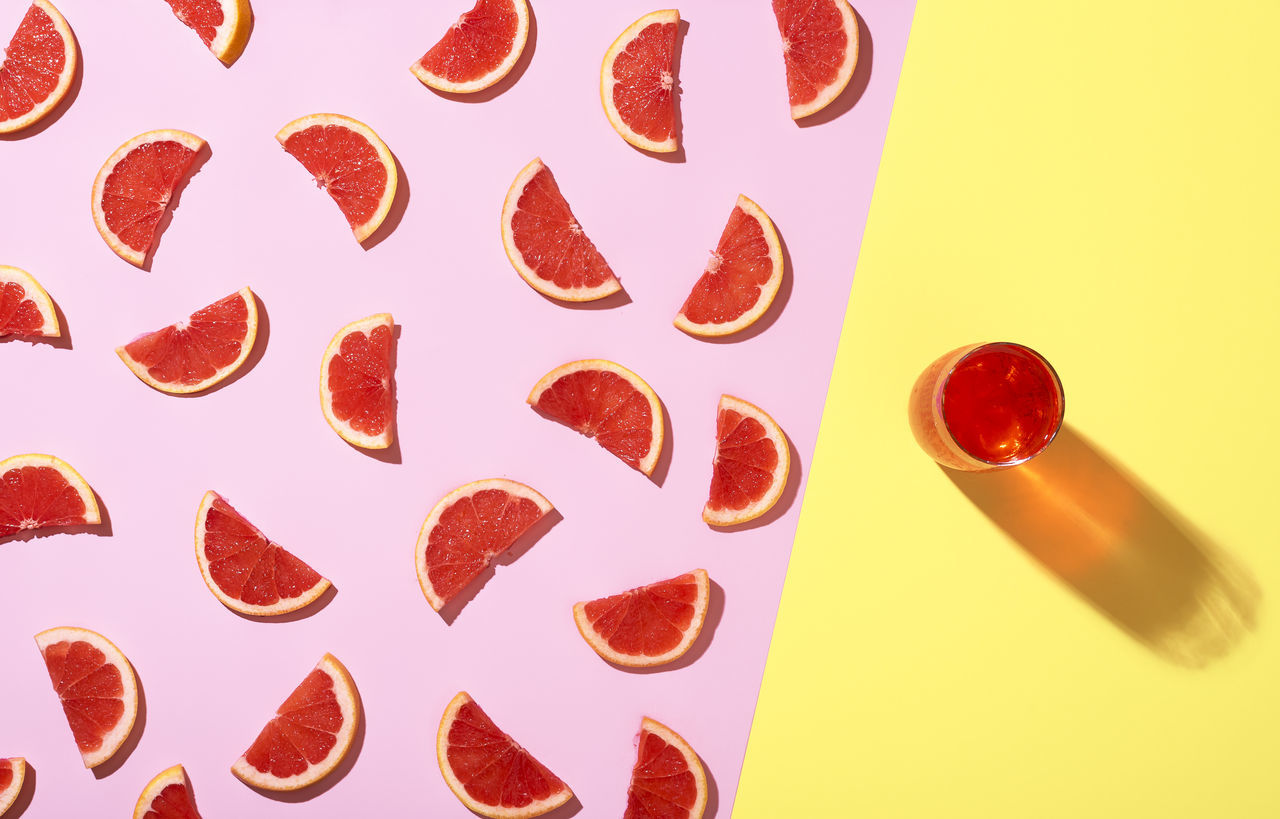
It’s centralized around the themes of space and color; two very important elements for visual marketing and brand communication. The photos feautured are really creative and you can see the thought that’s gone into every concept. We see many examples of brands that are communicating with the same punchy colours paired with minimalist backgrounds. Klarna and N26 spring to my mind, but I also see this photo collection working across various social channels.
The visual style and the fluidity of themes means that these images will be perfect for many different brands during this time when image licensing is allowing brands to meet their deadlines despite delays and distruptions. The images are approachable for a wide variety of audiences, avoid controversy and stereotyping, and remove products and people, yet remain just as eye-catching.
Why are these images ideal for marketing campaigns?
When it comes to design, these images are a dream to work with. They lend themselves to being easily manipulated without any mess. For example, changing colours or extending canvas areas would be simple due to their single colour backgrounds. This means there’s a lot more space to add and work with when it comes to your marketing message.
What’s the benefit of licensing these images versus the benefit of producing them yourself?
Besides the costs saved from running a full-on production, the main benefit of licensing these kinds of images would be that you’re remaining on-trend. I believe that relevance is key in any brand communication.
Use visual elements that catch the eye and hold the audience’s attention. As most of us know, the timeframe for catching someone’s attention on social media or advertising is a slim one. Graphic design is the fundamental vice in this.
At a time when news global health raises a lot of uncertainty, these images will bring the kind of clairty and clear messaging audiences are searching for.
What visual trends do you see in this image collection?
Within our recent Visual Trend Report, we dedicated a section to discuss what we called the ‘Commercial Creative’. The report breaks down the playful aspects of using these kinds of images and focuses on value they have to millennial target audience groups as well as the colour trends we expect to see a lot more of this year.
In short, this image collection is a strong expression of what is being created and contributed by our global community of photographers on EyeEm Market. When it comes to the ‘Commerical Creative,’ it’s simple really; production styles without the production!
Speaking of color trends, what’s the significance of color in these images?
There’s no particular message behind the wide spectrum of colors in this image colleciton. However, I’m assuming that most people will have some degree of familiarity with colour psychology. In colour theory, blue is often associated with calmness or trust, purple luxury or wealth, orange and yellow often demand the viewer’s attention to something encompassing a message of high-energy or warmth.
To throw in a loose example, sports teams that you might associate with bright colour kits often have a better percentage of winning. If one team is in black and the other in bright red, it makes it very difficult for the players in black not to have their attention drawn to the red.
It’s the same with these visuals. The use of bold and bright colors, means that you can achieve the eye-catching marketing campaign quickly and easily; whilst remaingin on-brand too.
What’s your advice for brands just starting out in graphic design?
The visual elements of design play a huge roll in how your audience will come to relate to your product or the core message of your brand. My advice would be not to understate the importance of working hard and developing a strong brand design system, no matter how early in development a company or product might be.
I’m sure many people can relate to perhaps wanting to purchase a product or service from a particular company, only to eventually turn away because perhaps the website or product was a mess or inconsistent. We judge by our first impressions all too often. So, having a well-considered brand guideline that is well executed by a designer should not be last on the to-do list. If however, you’re currently unable to collaborate with a designer or use a full creative team, then this image collection is the perfect substitute.
These images allow you to have the ideal canvas for working on your marketing campaign. They’re simple and clean, so you’ll be able to achieve that visual consistency that can make the biggest impact on your audiences’ first impressions.
How do you make sure your text or graphics stand out, and that the photo doesn’t overshadow your marketing message?
Sometimes the photo is the graphic, and other times the graphic helps illustrate the photo. What’s important is to keep in mind the design principles of spacing. The proximity of all elements, symmetry and order. All these things need to be considered when working with visual content. To achieve this effectively you need space to work with. This collection will be able to help with that and make it even easier.
Don’t cancel your summer campaigns. Take a look at our new image collection and keep your marketing efforts stronger than ever.
Looking for a more bespoke image solution? We’re still running our custom photo shoots all around the world. Find out more and speak to our team about how we can help you make your next campaign happen.
Download our Visual Trend Report to find out more about the critical trends shaping the global marketing landscape.